| Image |
Comment |
| 05/11/2005 10:19:02 PM |
At the balcony of heavenby marvinComment: I feel like the person, building, and balcony in the bottom right corner were included as an excuse for the photoshopped clouds which dominate the rest of the image. The strong line at the top of the building enhances the appearance that these are two separate compositions, both of which have a clear, but only mildly interesting focal point. I think that the composition would be improved if there was a greater attempt to tie the two segments of the image together (e.g. having the figure on the balcony looking expectantly toward the converging cloud formation, and possibly burning the clouds at the center of the spiral to make the focal point enigmatic rather than anti-climactic).
On a purely technical note, there isn't enough light on the front of the figure on the balcony to clearly make out any features. This may have been a creative decision to refrain from anchoring the figure's identity to a particular person, but it feels more like you neglected to bounce enough light onto the person's front side. A fill flash or a reflector could have helped with this. The pronounced difference in contrast between the bottom corner and the cloud formation seems like an overdone attempt to direct the viewer's attention.
This is a very creative vision, but I feel that with some straightforward changes it could easily be a ribbon winner. |
 Photographer found comment helpful. Photographer found comment helpful. |
| 05/11/2005 03:56:26 AM |
Alan's Past Comes Back To Haunt Himby Mr_PantsComment: I can't tell if the dark shadow that Alan's hiding in is supposed to be that of the cigarettes, or just a door. The lighting/shadows are a bit harsher than I'd like, but that's typically one of the more difficult aspects of making forced perspective look real. |
| Photographer found comment helpful. |
| 05/11/2005 03:53:30 AM |
Drawing out my dreamsby mpembertonComment: I find the mosaic / cubist processing done on this image distracting. It seems to highlight the lines in the background, drawing attention away from the pencils. This might have looked better in B&W, which would have highlighted the textures of your subject. |
| Photographer found comment helpful. |
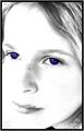
| 05/11/2005 03:49:49 AM |
I Can Dreamby NeuferlandComment: And it appears that you can do so in color. I think that the eyes would have been a stronger focal point if they had more detail or a more well-defined catchlight. The selective desaturation only draws my attention to the fact that I can't even distinguish between her pupil and iris. Most of the detail on the face is blown out (which again draws attention to the eyes), but there are still a few well-defined, large freckles. Since advanced editing was allowed, you could have cloned these out, but I might have preferred it if you'd have left more of the detail in whichever channel contained the freckles, which would have preserved the contours of your model's face. |
| Photographer found comment helpful. |
| 05/11/2005 03:42:24 AM |
Sweet Dreamsby autoolComment: This appears to be a partially open flower bud. In general, macro shots of flowers look better if the flower has been lightly misted with water. Something about the light and focus here strikes me as somewhat overly-homogeneous. I'd like to see either a bit more contrast from the light or a bit more texture in the petals; as it is, I see a yellowish/pinkish/reddish flower with very little texture or depth to it. The way your subject is framed lends a bit of ambiguity to the item depicted, but I think that the focus would need to be a bit softer for this to be sufficiently enigmatic. |
| Photographer found comment helpful. |
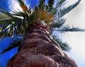
| 05/11/2005 03:36:26 AM |
Dreaming Of Floridaby spitz66Comment: The way this is framed splits the image in half, seemingly the "white, cloudy sky" half and the "deep blue sky punctuated with fluffy clouds" side. If this split was intentional, I'd be more interested in seeing more of the blue side (e.g. to the end of the palm fronds) and less of the white. I really like the perspective, but I think that this may have been a more interesting composition if the tree split the frame at a more interesting angle (e.g. from the bottom left corner to the top right corner). Using a shallower DOF might have also offered some interesting alternatives. |
| Photographer found comment helpful. |
| 05/11/2005 03:30:58 AM |
My Dream of Childhoodby rlinn3Comment: The hint of purple / lilac in the bottom left corner draws my eyes out of the frame (which is presumably not your intent in this case). The grainy feel of the photo seems appropriate, but I think that a slightly softer focus may have enhanced the dreamy / nostalgic feel of the picture. Nice DOF. |
| Photographer found comment helpful. |
| 05/11/2005 03:27:53 AM |
Blurry Dreams of Beautiful Placesby TDCollinsComment: I like the effect, but since the focus of flow is directed at the end of the stone bridge, it would be nice to see something specific there to look at (e.g. someone leaning against the bridge's railing). |
| Photographer found comment helpful. |
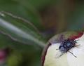
| 05/11/2005 03:25:15 AM |
Metamorphosisby CantiqueComment: Freud would certainly have fun with this one. On a strictly photographic note, the blurry leaf / wing-looking-thing in the background looks like it may be an intentional repetition of the form of the fly's wings, or it may just be some blurry thing in the background. If it was intended, having it oriented in a cardinal position relative to the fly (e.g. offset 90, 180, 270, or 360 degrees from either of the fly's wings) would have enhanced the effect. Posing the fly would, of course, be the hard part. If the repetition was unintentional (or the fly just wouldn't pose), you may have been better off narrowing the DOF a bit further to reduce the clear lines in the background. |
| Photographer found comment helpful. |
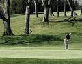
| 05/11/2005 03:18:24 AM |
Of Birdies and Eaglesby OlyuziComment: You dream of _golf_? Why, that's enough to put a guy to sleep.
I think that this would have been a stronger shot (photographically) if the shadows from the trees weren't so prominent. Conversely, if this were _my_ picture, the dream would be a nightmare, and I'd render this in sepia and crank the contrast to emphasize the shadows. The shadow from the tree at about 12 o'clock looks like it's reaching down to grab the unsuspecting golfer. |
| Photographer found comment helpful. |
Home -
Challenges -
Community -
League -
Photos -
Cameras -
Lenses -
Learn -
Help -
Terms of Use -
Privacy -
Top ^
DPChallenge, and website content and design, Copyright © 2001-2025 Challenging Technologies, LLC.
All digital photo copyrights belong to the photographers and may not be used without permission.
Current Server Time: 08/21/2025 02:57:14 PM EDT.