| Image |
Comment |
| 05/22/2005 11:46:28 PM |
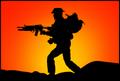
while we sleepby DustDevilComment: Unless I'm very much mistaken, this is an action figure. I find this amusing, and find it more amusing that someone requested a DQ. |
 Photographer found comment helpful. Photographer found comment helpful. |
| 05/22/2005 11:30:25 PM |
|
| Photographer found comment helpful. |
| 05/22/2005 10:55:30 PM |
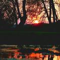
Before Sunriseby kmbr2001Comment: The red beam in the bottom right corner of the image distracts me from an otherwise excellent image. |
| Photographer found comment helpful. |
| 05/22/2005 10:51:43 PM |
|
| Photographer found comment helpful. |
| 05/22/2005 10:51:03 PM |
Amish Sunsetby audinutComment: The colors look rather muddy here, and the image feels unnatural somehow; too much sharpening perhaps. |
| Photographer found comment helpful. |
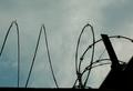
| 05/22/2005 10:48:40 PM |
safety first (barbed-wired fence)by redpandaComment: That looks like razor wire, not barbed wire. I think that this might have been stronger if photographed nearly parallel to the fence, perhaps looking through the tube formed by the razor wire. |
| Photographer found comment helpful. |
| 05/22/2005 10:42:10 PM |
Dusk over the Cityby TallblokeComment: The colors in the water are the most interesting part of the image. The skyline isn't particularly noteworthy, and I'm unable to identify a specific element which you framed as the subject.
|
| Photographer found comment helpful. |
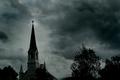
| 05/20/2005 11:39:25 PM |
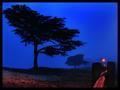
The Town Steepleby TommyMoe21Comment: Dodging the tip of the steeple was a good idea, but you went so far that the editing is obvious. In my opinion a somewhat more subtle edit would have been much better. Even so, this is one of my top picks so far. I really like the shot's moody feel. |
| Photographer found comment helpful. |
| 05/20/2005 11:34:25 PM |
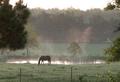
Standing in the pastby kcumanComment: I really like this image, but I can't see how it meets the challenge. The portrait crop mirrors the shape of the frames reflected in the lens, but I think that squaring the image slightly to include a little more breathing room to the left and right of the lens would have improved the image. |
| Photographer found comment helpful. |
| 05/20/2005 11:30:03 PM |
One Last Castby GatorguyComment: I like the contrast between the two subjects. However, because this is only a silhouette, the close placement of the two people makes it unclear what their relative position is and they seem to blend together. If possible, I would have had them move farther apart or move the camera to a different angle to increase the separation. |
| Photographer found comment helpful. |
Home -
Challenges -
Community -
League -
Photos -
Cameras -
Lenses -
Learn -
Help -
Terms of Use -
Privacy -
Top ^
DPChallenge, and website content and design, Copyright © 2001-2025 Challenging Technologies, LLC.
All digital photo copyrights belong to the photographers and may not be used without permission.
Current Server Time: 08/21/2025 05:32:11 AM EDT.