| Image |
Comment |
| 06/13/2005 11:15:19 PM |
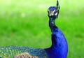
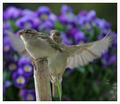
Contactby photogenixComment: I'd have liked to see more of the bird's eyes, crown or tail feathers. As it is, I feel like I've only got hints of the first two. The angle of the bird's neck highlights the ruffled feathers which disrupt an otherwise nice curve. The color of the background seems a bit more saturated than the bird itself; the presentation would have been stronger if you'd have desaturated the background somewhat.
|
 Photographer found comment helpful. Photographer found comment helpful. |
| 06/13/2005 11:10:28 PM |
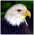
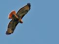
Freedomby aerogurlComment: The band of white feathers bordering the brown seem excessively white and overexposed; this probably could have been reduced / eliminated by adjusting the curves. The DOF seems a touch shallow. This is the best portrait-style picture I've seen so far in the challenge. |
| Photographer found comment helpful. |
| 06/13/2005 11:07:00 PM |
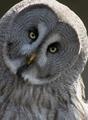
Hooo whoo you looking at ?by frogletComment: The brightness difference between the bird's face and the top of it's head and shoulders is distracting; you could have probably fixed this by adjusting the curves. The face itself seems sharp, but underexposed. A catchlight in the owl's eyes would have really helped to bring this image alive. |
| Photographer found comment helpful. |
| 06/13/2005 11:04:34 PM |
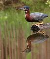
Just before take offby Rando D300Comment: The focus on the bird's head is a bit soft. A catchlight in the eyes would have made his face stand out more. I really like the reflection in the water.
|
| Photographer found comment helpful. |
| 06/13/2005 11:00:59 PM |
Concentrationby p3wizComment: The blurry rocks in the foreground seem to dominate the image without contributing much aesthetic value. I think that a tighter crop would have improved this image.
|
| Photographer found comment helpful. |
| 06/13/2005 10:59:24 PM |
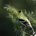
American Goldfinchby Links 2 3 4Comment: I'd have liked to see the separation between the bird and the background more clearly defined. A shallower DOF might have helped with this somewhat. If you hue shifted the yellow channel you could probably move the color of the branches in the background closer to green and the bird more toward yellow. In any case, this is one of the better portrait-style bird pictures that I've seen in the challenge so far. |
| Photographer found comment helpful. |
| 06/13/2005 10:53:35 PM |
|
| Photographer found comment helpful. |
| 06/13/2005 12:17:50 AM |
|
| Photographer found comment helpful. |
| 06/13/2005 12:13:43 AM |
I'm not looking.....by agwrightComment: Although I'd be interested in seeing versions with a larger DOF, my only real criticism is the single blade of grass jutting into the bottom of the frame. |
| Photographer found comment helpful. |
| 06/13/2005 12:06:22 AM |
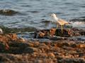
Sterna Paradisaby hjolliComment: There's too much negative space here. If the background weren't blown out I'd find this image more interesting. It looks like the crop is slightly off center, which I find distracting. |
| Photographer found comment helpful. |
Home -
Challenges -
Community -
League -
Photos -
Cameras -
Lenses -
Learn -
Help -
Terms of Use -
Privacy -
Top ^
DPChallenge, and website content and design, Copyright © 2001-2025 Challenging Technologies, LLC.
All digital photo copyrights belong to the photographers and may not be used without permission.
Current Server Time: 08/21/2025 02:04:10 AM EDT.