| Image |
Comment |
| 04/11/2009 04:50:16 PM |
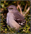
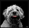
Basking in the Glowby scottiehamComment: I read your thread about a critique and thought I'd offer my comments. I'm no means an expert in anything, but this picture looks really good to me. I'm an avid bird fan (or twitcher as they like to call us over here). I don't sit out in fields all day trying to spot a rare bird, bit I do love to sit and watch them from my conservatory on the feeders in the back garden. I personally think this is a lovely shot. The bits in the background are a little distracting but you don't get much control over that in these sort of situations.
I think the composition is pretty central, in fact the bulk of the bird is left of centre, with the bird looking out of the frame. I personally think that a right of cantre composition with the bird looking into the frame might have helped if that was an option. To be very picky, the blue leaves/petals or whatever in the foreground are also a little distracting and perhaps a desat or changing the colour to green for those leaves might help them blend in better. The reddish line at 8 o'clock (twig or something)also draws the eye. But those are really very picky comments - but that's perhaps how free studies are judged.
You can't always pick your subjects, perhaps one of the more colourful birds in an exact same image might have scored more highly (cardinal, robin etc) as people tend to have more of an affinity with brightly coloured birds.
From a purely personal viewpoint, I think it's a really nice shot. The clarity on the feathers is really good.The lighting is superb imo and perhaps in a bird challenge it would have done much better. Free studies always tend to be very hard to get a good score in. Your "She's a Gem" photo is a much better shot (I scored that one a 9 at the time). The composition is a lot cleaner, and she is looking directly with the camera which makes for a much more engaging shot. |
 Photographer found comment helpful. Photographer found comment helpful. |
| 04/10/2009 04:52:32 PM |
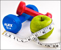
One Fit Granny!by basssman7Comment: I'm not sure where the weights, apple and tape measure idea comes from, there are a whole bunch of them in this challenge... must be an American thing that us Brits don't get. This is the best of the bunch in my opinion though. Nicely focussed and exposed, and a nice combination of the primary colours. |
| Photographer found comment helpful. |
| 04/10/2009 04:50:45 PM |
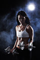
Blue Steel by LalliSigComment: Blue steel = Blue ribbon in my eyes. Definitely the best of the bunch. Moody, smouldering and gorgeous model. I'd kill to have a body like that lol... except I like cheese and dislike weights. Ho hum. |
| Photographer found comment helpful. |
| 04/08/2009 08:49:33 AM |
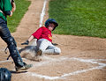
Hit a homerun for healthby SheryllComment: Nice action shot. The helmet lower left is a distraction, but I realise with basic editing rules you could not do much about that really. |
| Photographer found comment helpful. |
| 03/29/2009 02:13:30 PM |
|
| Photographer found comment helpful. |
| 03/23/2009 03:29:18 PM |
|
| Photographer found comment helpful. |
| 03/19/2009 04:53:29 PM |
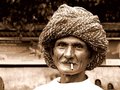
The Turbanatorby ankursomaniComment: You have asked for more comments in the gripe thread... I gave this a six which is in line with 177 other like-minded voters, 6 being the vote you received the most times. In my scale, 6 is good technical knowledge and composition, just a bit lacking in some areas.
Upon a revisit, I find that the object in the lower left hand corner to keep drawing my eye, stopping me from actually "looking" at the guy. So to improve the shot I would clone out, or crop out that part of the image. Also I find the girls behind the shoulder to be a distraction, but removing those might require a bit more work. I would have scored it more highly with those amendments as my eyes would remain fixed then on the main subject, which is a good one. Some of the other comments also mention a tighter crop which I presume is for the same reason as I suggest, the lower left corner. |
| Photographer found comment helpful. |
| 03/19/2009 03:31:22 PM |
National Geographic!by kbhatia1967Comment: Came back to comment after the gripe thread... for me the border completely detracted from the image as it is really "in your face". I also felt that the lighting was harsh, and the girls eyes lacked focus and sparkle and the shot as a whole lacks some clarity (which I guess is a byproduct of the nature of the camera). Colours framing and subject matter were fine. I scored it a 5, which appears to be the most common viewpoint with 185 others also voting it a 5. Your tags have it as "snapshot" and "candid", and I think that is a fair self-assessment. A nice enough shot but it just didn't wow me. I would probably have given it a 6 if it didn't have the yellow border. |
| Photographer found comment helpful. |
| 03/19/2009 02:07:04 PM |
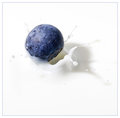
Blueberry Splash Reduxby h2Comment: I revisited this after your gripe thread comment. I gave this an 8, placing your shot within my top 100. I also agree that it is better thsn the other two variants on this image. But photography is subjective. There will always be people that vote higher on dog shots, those that vote on landscapes, those that vote higher on bugs. |
| Photographer found comment helpful. |
| 03/18/2009 04:28:33 AM |
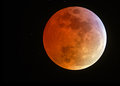
Total Lunar Eclipseby marboComment: Oooohhhh, so sorry you didn't ribbon for this awesome shot. I gave it a 10, and had it pegged for the blue. |
| Photographer found comment helpful. |
Home -
Challenges -
Community -
League -
Photos -
Cameras -
Lenses -
Learn -
Help -
Terms of Use -
Privacy -
Top ^
DPChallenge, and website content and design, Copyright © 2001-2025 Challenging Technologies, LLC.
All digital photo copyrights belong to the photographers and may not be used without permission.
Current Server Time: 08/05/2025 12:37:52 AM EDT.