| Image |
Comment |
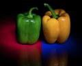
| 11/10/2010 01:23:58 PM |
"we are all the same inside"by ThaiComment: That we are. I find my eye wandering a little around this image, probably because of a lack of crisp focus on the main focal points of the peppers. A nice concept though, and the red/green falls squarely into the challenge remit (unlike some of your competition). |
 Photographer found comment helpful. Photographer found comment helpful. |
| 11/10/2010 01:22:17 PM |
Rubies and Emeraldsby ChandiComment: Technically complementary colours are red/green or orange/blue so you've got a bit of a hybrid going on here. Orange and green are actually "secondary" colours to purple. Although the title says "rubies" I think it's a strectch to consider this as red. The actual capture is nice enough, although this type of shot is done to death so you may get marked down by some for lack of originality (not me though). I do however feel that the border completely detracts from the image. The thin red line around the green just looks angry. |
| Photographer found comment helpful. |
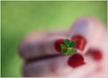
| 11/10/2010 01:07:41 PM |
Unlucky cloverby erikingComment: I would have preferred just a little larger depth of field, bringing some of the fingernails into focus a little. Nice compositional balance though, and red/green is slap bang on the challenge (unlike some of the competition!) |
| Photographer found comment helpful. |
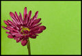
| 11/10/2010 01:06:31 PM |
Go Greenby BackpackRComment: Technically it should be purple/yellow or red/green for complementary colours... green/purple are technically "secondary" colours - but enough science! I actually love the shot. It has a great balance and "feel" to it. Very simple, and the border works well too. I'm not going to go so far as to say this will be a top 10 finisher as there are some great takes on the challenge as competition. I will however say that this is one of my favourites, and I hope you finish well. |
| Photographer found comment helpful. |
| 11/10/2010 12:55:06 PM |
spritzy aperitif by myceliumComment: Great image, nice balance and lighting. Is that sort of border legal in basic though? If so, you'll have to teach me how to do it... looks really good! |
| Photographer found comment helpful. |
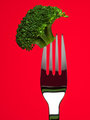
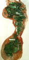
| 11/10/2010 12:53:39 PM |
Broccoliby h2Comment: Crisp!
I love broccoli. Pity it's basic editing as there are a couple of (very minor) scratches on the fork which detract slightly from the image. Lighting is spot on. |
| Photographer found comment helpful. |
| 11/10/2010 12:51:28 PM |
|
| Photographer found comment helpful. |
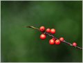
| 11/10/2010 12:50:23 PM |
A Sprig of Berries Amongst the Evergreensby MaryOComment: Love the balance, composition, border and depth of field. I can't help feeling though that this is somewhere outside of basic editing. It looks like there is some haloing around the berries which imply a selection, with perhaps gaussian blur added to everything but the berry twig? I may be well off, so won't put in a DQ request :-) but looking at the image I do "feel" as though something is not quite right. Of course the haloing could be chromatic aberation from a telecoverter or suchlike, so I apologise unreservedly if I am wrong! I will obviously mark this entry as if it were legal. |
| Photographer found comment helpful. |
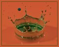
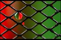
| 11/10/2010 12:27:59 PM |
red/greenby libertyComment: Well executed. This type of shot isn't as easy to achieve as it looks, and the colours are spot on for the challenge. Nice to see something other than flowers/fruits. The only distraction and detraction from the image is the secondary drip below the main one. I realise this is basic editing, but I think this shot would have more impact if that were removed. |
| Photographer found comment helpful. |
| 11/10/2010 12:25:57 PM |
....and I would walk on broken glass.....by taff209Comment: Interesting idea, certainly different. Seems to lack clarity though... either focus or sharpening... and the reflection of light on some of the glass is a bit harsh. Finally, I would boost the red channel in a hue/saturation layer to make it really vibrant as at the moment it looks a bit orangey. Kudos for doing something different though. |
| Photographer found comment helpful. |
Home -
Challenges -
Community -
League -
Photos -
Cameras -
Lenses -
Learn -
Help -
Terms of Use -
Privacy -
Top ^
DPChallenge, and website content and design, Copyright © 2001-2025 Challenging Technologies, LLC.
All digital photo copyrights belong to the photographers and may not be used without permission.
Current Server Time: 08/06/2025 11:55:25 AM EDT.