| Image |
Comment |
| 09/23/2016 09:25:50 AM |
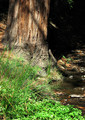
Riparian Redwoodby GeneralEComment: This rates a 8 for title alone. Sometimes we can be too subtle with titles and this might be the case here as riparian is not an ordinary everyday type of word. |
 Photographer found comment helpful. Photographer found comment helpful. |
| 09/23/2016 09:24:23 AM |
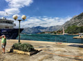
Safe Zoneby mrbig65Comment: A tad too dark - the back lighting doesn't help this at all. Still, little ones and water - what's not to like? |
| Photographer found comment helpful. |
| 09/23/2016 09:23:28 AM |
Helen and Athenaby LydiaComment: My impression is just a very slight out of focus - the foreground is fine, but the rest of the image just seems slightly off. Probably a DOF thing. |
| Photographer found comment helpful. |
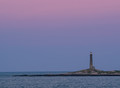
| 09/23/2016 09:22:09 AM |
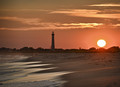
At the Lighthouseby DCrest01Comment: When I see lighthouse images, I always look to see if the light was captured - in this case, it was and it enhances the overall impact of the composition. A lot of light and shadow here with warm color you don't see all the time. |
| Photographer found comment helpful. |
| 09/23/2016 09:20:41 AM |
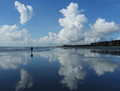
A Walk in the Cloudsby cheltzelComment: A very different look - like the reflection and the title expresses the intent of the capture perfectly. Could have used a little more exposure and gamma boost, but it still works. |
| Photographer found comment helpful. |
| 09/23/2016 09:19:00 AM |
Single Twin Lightby bobnospumComment: Very emotionally evocative - a lone signal on a lonely shore - kind of begs for a "dark and stormy night" bad sentence entry. :) |
| Photographer found comment helpful. |
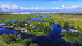
| 09/23/2016 09:17:24 AM |
Where the Lake Meets the Swampby SEGComment: This would look great in a promotional brochure or commercial project - say a calendar. Under rated originally - moved form a 7 to an 8. |
| Photographer found comment helpful. |
| 09/23/2016 09:15:51 AM |
edgeby jmritzComment: I want to rate this higher, but can't - it seems much too flat in tone and contrast. |
| Photographer found comment helpful. |
| 09/23/2016 09:15:11 AM |
ebb tideby tvsometimeComment: I've had to return to this several times - I believe my initial rating of 7 is warranted. Having said that, the impression of depth and distance is very good, it's just not that interesting to me. |
| Photographer found comment helpful. |
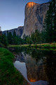
| 09/23/2016 09:11:49 AM |
El Cap Sunrise from Cathedral Beachby NeilComment: I think this is a touch too dark. On first run through, I had a negative impression, but on a second look, I feel it needs a higher rating. Great detail, excellent color - overall impression of the image positive. 7 to a 9. |
| Photographer found comment helpful. |
Home -
Challenges -
Community -
League -
Photos -
Cameras -
Lenses -
Learn -
Help -
Terms of Use -
Privacy -
Top ^
DPChallenge, and website content and design, Copyright © 2001-2025 Challenging Technologies, LLC.
All digital photo copyrights belong to the photographers and may not be used without permission.
Current Server Time: 12/21/2025 03:50:50 PM EST.