| Image |
Comment |
| 05/07/2009 10:42:14 PM |
"The Darkness Within"by jomernerComment: As a result of the flat gray cast to the image that masks a slight over exposure of the subject, this isn't as impressive as it could be. |
 Photographer found comment helpful. Photographer found comment helpful. |
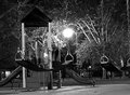
| 05/07/2009 10:40:28 PM |
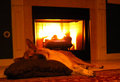
Goodnight Maxby jcarComment: Dogs and fire places are a natural candid subject as they both fit together like honey and fresh bread. In this case, the image doesn't work due to under exposure of the subject and the over exposure of the fire in the fire place. A little more time composing this image would have helped significantly. |
| Photographer found comment helpful. |
| 05/07/2009 10:38:59 PM |
darkness in a grassy fieldby tSkyeComment: The soft focus was not a good choie for this image as the dark overwhelms the subject as a result. A snapshot quality image, there isn't any significant artistic or technical impression made with this image. |
| Photographer found comment helpful. |
| 05/07/2009 10:30:50 PM |
Entranace to the darknessby anferhComment: Not sure exactly what this is supposed to be or even what it is. Sometimes subtlety can be over done and this is a good example of that - it just doen't make any sense to this reviewer. And while this reviewer never likes to rate on the average, there just isn't anything to hang a positive comment on and for this reviewer that hurts because there is always something postive to say. |
| Photographer found comment helpful. |
| 05/07/2009 10:26:32 PM |
VAAAROOOMby stfleckComment: While the author might have had an idea in mind, the image fails to convey this idea properly. The unnatural sky line, ungainly blank space and the rather odd red streak with blown out white just don't work together to create any sort of idea or impression. |
| Photographer found comment helpful. |
| 05/07/2009 10:23:30 PM |
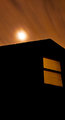
Moon Over The Bedroom Windowby EssAreDubyaComment: More thought into how this image was presented would have helped. The unnatural monotone effect doesn't significantly impress and the large blank space is just that - large and blank. Additionally, the moon is over exposed which is in direct opposition to the gentle monotone sepia and is jarring and unrealistic. |
| Photographer found comment helpful. |
| 05/07/2009 10:21:19 PM |
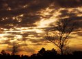
Last rays of hope.. after that its all darkby yjoshiComment: This image needs HDR because it would have been one heck of an image if treated that way. The monotone feel is very effective and the foreground is not overwhelming as it is in other images in this challenge. HDR would have helped improve the sun rays and given some depth and dimension to a rather flat image which the right on the edge of over done whites normally deliver but in this case don't. Underrated originally at 6, it's been rerated to a 7 for it's right on the edge of outstanding impression. |
| Photographer found comment helpful. |
| 05/07/2009 10:17:53 PM |
Tonight im the mood for...by DaRkYeComment: Laugh out loud funny if only because this is a typical behavior that always makes dog owners smile and maybe, just maybe a reward of a slice of balogna will be given. Missed on the first ratings pass, this image has a charm of it's very own. While it could use a little more exposure control, it's still humorous and that is always appreciated. Originally rated a 6, a rating of 7 is in order for it's humor content. A suggestion for the future would be to use a little longer exposure to create more impact. |
| Photographer found comment helpful. |
| 05/07/2009 10:14:50 PM |
Deserted at Duskby daewoo826Comment: Excellant black and white conversion that wasn't fully appreciated on first ratings speed review. On comment review, there is one issue that immediately makes an impression and that is the very slightly overdone white spotlight. That being said, the rest of the image is technically excellant and a good example of the zone system at it's best. Given that the spot light is actually the reason this image has it's own wow/pop factor, the image is rerated from a 6 to an 8. Well done. |
| Photographer found comment helpful. |
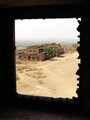
| 05/07/2009 10:12:44 PM |
Through the Dark Window... of History...by prachiComment: Another dark to light image that could have been better presented. This is one image that, while effective, suffers from the large washed out horizon and sky. This is one image that should have been a candidate for HDR treatment that would have given it wow factor and some significant pop. |
| Photographer found comment helpful. |
Home -
Challenges -
Community -
League -
Photos -
Cameras -
Lenses -
Learn -
Help -
Terms of Use -
Privacy -
Top ^
DPChallenge, and website content and design, Copyright © 2001-2025 Challenging Technologies, LLC.
All digital photo copyrights belong to the photographers and may not be used without permission.
Current Server Time: 06/27/2025 11:04:22 AM EDT.