| Image |
Comment |
| 04/23/2012 12:09:24 PM |
|
 Photographer found comment helpful. Photographer found comment helpful. |
| 04/23/2012 12:05:29 PM |
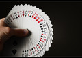
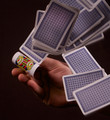
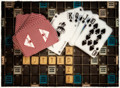
Is That Your Card?by todbedyComment: Heh - I love card tricks and this is a good representation. Nice crisp focus, great balanced color, creative lighting - nice job. |
| Photographer found comment helpful. |
| 04/23/2012 11:54:08 AM |
|
| Photographer found comment helpful. |
| 04/23/2012 11:53:26 AM |
White Rabbit Red Queenby surfinbirdComment: Just wondering here, but would this have worked better if the card was in color? Maybe a little closer look rather than the soft focus? Still, a worthy idea. |
| Photographer found comment helpful. |
| 04/23/2012 11:52:26 AM |
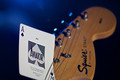
Motörheadby giantmikeComment: Good one - clever use of guitar and Ace of Spades - fifth or sixth album? Can't remember. Anyway, I like the concept - nice although I wonder how many will get it. Side note: I bought a Squire Strat for my granddaughter and ended up modifying it with parts from a '69 Strat basket case I had hanging around. Came out nice and sounds like an early era Strat. |
| Photographer found comment helpful. |
| 04/23/2012 11:50:37 AM |
Arise, my future!by KfirLevAriComment: Nice concept and a nice job making it all work. For some reason, the image looks a little greenish to me, but I just color corrected my monitor so it's pretty accurate. Can't complain about anything. |
| Photographer found comment helpful. |
| 04/23/2012 11:08:41 AM |
Key Cardsby rhypecComment: Very clever composition. Nicely composed and executed. A little sharper focus would have made it better I think - lighter contrast, but it works as it is. |
| Photographer found comment helpful. |
| 04/23/2012 11:07:23 AM |
Not as expectedby GilesComment: How many times have we done this by accident? Solid composition, good color and action - very nice capture. |
| Photographer found comment helpful. |
| 04/23/2012 11:06:18 AM |
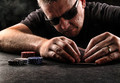
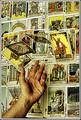
Card painterby gpureticComment: I know somebody who makes custom cards - it is a real art form depicted nicely here. The image looks a little washed out and the colors don't have the "pop" you would normally expect for an image like this. Its also a little large - a more condensed image might have made for a better composition. Still, a worthy image and nicely executed. Well done. |
| Photographer found comment helpful. |
| 04/23/2012 11:04:08 AM |
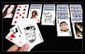
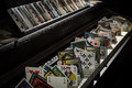
Pastimes for a rainy afternoon...by Bear_MusicComment: First of all, I'll admit that my eye balls are old and I wear bifocals, but for the life of me I couldn't get this image to properly focus in my minds eye. I couldn't figure it out for a while, but it is the effect of over sharpened imagery on the white cards. If you look at the top of the white cards, you see a black outline - that usually is the result of over sharpening or going crazy with the unmask control. Also at the left corner of the Ace behind the Joker card is what looks like a burn mark - that is another sign of over sharpening. A little more lighting and less sharpening would have made this at least a 9 if not a 10. I think an 8 is reasonable though because the composition is nifty and well thought out. |
| Photographer found comment helpful. |
Home -
Challenges -
Community -
League -
Photos -
Cameras -
Lenses -
Learn -
Help -
Terms of Use -
Privacy -
Top ^
DPChallenge, and website content and design, Copyright © 2001-2025 Challenging Technologies, LLC.
All digital photo copyrights belong to the photographers and may not be used without permission.
Current Server Time: 06/25/2025 07:18:02 PM EDT.