| Image |
Comment |
| 05/27/2009 07:52:23 AM |
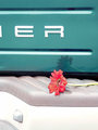
Girls in Trucks (soft in all the right places, tough in all the right ways)by pixelpigComment: ER is probably about the right response from me. I can only assume it's Chrysler because that's the only car brand I can think of that ends with ER. Not entirely sure what you're trying to sell me here, I could see the point if you were saying "Girls AND Trucks" but not "Girls IN Trucks".
The picture itself doesn't particularly prompt me to buy anything so I think as an ad it's not quite there. 3 from me. |
 Photographer found comment helpful. Photographer found comment helpful. |
| 05/27/2009 07:41:52 AM |
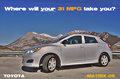
2009 Toyota Matrixby CitadelComment: Good exposure and location, like the message you're putting across as well.
The shot seems a little flat though, it could be there there's a lot of grey in it and it all seems to blend together, but it just doesn't jump out the way you expect a car ad to do. 7 from me. |
| Photographer found comment helpful. |
| 05/27/2009 07:32:11 AM |
Jeep Wranglerby karenkComment: Very nice shot, it's a refreshing change from all the sleek shiny entries so far. Almost everything works here, the location, the mud all over the Jeep, the sky and the background. I say almost because I would have preferred to see it without the 2 guys, just the vehicle on it's own. 8 from me. |
| Photographer found comment helpful. |
| 05/27/2009 07:28:05 AM |
The Monster You Want To Wake You Up.by power47Comment: This would make a great ad for a bodyshop or parts place. The location and the fog in the headlights work very well, as well as the strong red from the lights. 9 from me. |
| Photographer found comment helpful. |
| 05/27/2009 07:18:32 AM |
Let BMW move youby bob_bobskiComment: Nice concept and good location, but it doesn't actually snow any of the car. If it wasn't for the title I wouldn't know what this was. |
| Photographer found comment helpful. |
| 05/27/2009 07:10:49 AM |
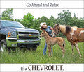
Go ahead. Relax. by LydiaComment: I like the idea and message you are sending across here, and it does feel like a well targeted ad, but I don't like the actual composition.
There's just not enough of the car in it, and it's not like one of those ads where it's all dark and you catch little glimpses of what looks like a great car, you've actually just cut most of it out! |
| Photographer found comment helpful. |
| 05/27/2009 06:54:56 AM |
Babes Magnet Wunderbike by AmeedEl-GhoulComment: You've let down what could be a potentially good ad here.
I think you're exposure, which admittedly must have been tricky, has left the car a touch dark. Also, the car itself feels out of focus, I'm not entirely sure if that's the case, but the back part definitely feels like it's not as sharp as it could be.
Now the biggey, the text ruins this add. What is otherwise a nice ad with some good scenery is completely ruined by the text. If I saw that by the side of the street I definitely wouldn't want one of those!
Giving this a 5, would have been a 7 if it wasn't for the caption! |
| Photographer found comment helpful. |
| 05/27/2009 06:51:09 AM |
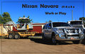
Nissian Navaraby CraftyComment: This is very good for an add, and a very well targeted one too as opposed to all the generic stuff I've been seeing so far.
The environment, the trailer, the positioning of this all scream "HEAVY DUTY OFF ROADER", which I think would do a great job appealing to a particular market segment.
My only complaints with this one are that the car feels a little bit crammed into the right side, and your border is actually cutting into it. Other than that, great shot. 9 from me. |
| Photographer found comment helpful. |
| 05/27/2009 06:47:40 AM |
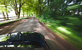
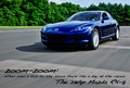
Mazda RX-8. It Moves You.by arron_christensenComment: This is a very good car ad, great exposure, good location, good framing and I love the sense of motion.
Can't flaw this one at all, hope you've included the details on how you did this one as I would like to read them.
10 from me. |
| Photographer found comment helpful. |
| 05/27/2009 06:43:07 AM |
Stand Out!by witt34Comment: This is VERY car add like! The text works very well in this shot, and feels completely appropriate. The only thing letting this one down is the big white thing (no idea what it is) in the top left corner.
The colours and the overall design are great, I would expect to see this on a large billboard by the side of the road.
9 from me, took 1 off a perfect 10 for the weird white object. |
| Photographer found comment helpful. |
Home -
Challenges -
Community -
League -
Photos -
Cameras -
Lenses -
Learn -
Help -
Terms of Use -
Privacy -
Top ^
DPChallenge, and website content and design, Copyright © 2001-2025 Challenging Technologies, LLC.
All digital photo copyrights belong to the photographers and may not be used without permission.
Current Server Time: 08/10/2025 08:31:40 AM EDT.