| Image |
Comment |
| 06/17/2009 06:06:58 PM |
Me & My Bug Buddhaby mileskeaComment: I find this picture kinda creepy. I'm having a hard time findng where the focus is at, and I'm thinking it is the shape and the shine from the Buddha figures that makes it look out of focus. I honestly don't know! F's me up =) Your lighting and post production of the photo coulnd't be better though! |
 Photographer found comment helpful. Photographer found comment helpful. |
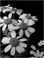
| 06/17/2009 06:06:55 PM |
Delicate Beautyby scooter97Comment: This photo stoped my voting last night because I didn't have a clue what to wright. I didn't like it at first, found it a bit "weak and boring", but having it in the back of my mind for a day kinda helped. Your composition is OK, and this is a very good black and white conversion. Thumbs up for that =) But still, pay attention to where your focus is at. It looks like the flower in the middle is in focus, and maybe that was intended, but in this case it is the flower in the bottom left corner that is "the center of attention", and that flower is slightly out of focus. And that is giving the entire photo the out of focus feel, which I don't find suitable for this. This was a very very long comment, and I hope you got something out of it =) |
| Photographer found comment helpful. |
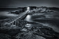
| 06/16/2009 06:35:16 AM |
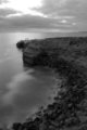
the islandby MichaelCComment: I'm getting a dark prison feel, and I like that. Dark, mysterious and powerfull. Love the light from the island, and your editing is sublime. |
| Photographer found comment helpful. |
| 06/15/2009 02:13:20 PM |
Bridal Marchby peterComment: It sounds like the bridal march, so that's good thinking. Can't help but saying that had you written it down yourself, getting that handwriting feel, would make a completely different photo, and a better one in my oppinion. But a good photo indeed! Maybe some stronger color on the rose. |
| Photographer found comment helpful. |
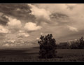
| 06/15/2009 02:05:51 PM |
Down in the Valley...by tfarrell23Comment: I like the composition and the image itself, but I'm not so keen on the tones you have used. Somehow makes the tree looks odd. |
| Photographer found comment helpful. |
| 06/15/2009 12:07:12 PM |
"Surprise!"by tmorninglory96Comment: There's to many chopped of kids here. Her head looks very overexposed, so that might be a reason for cropping the photo a little bit. Your duotones are good and perfect for this picture, though. |
| Photographer found comment helpful. |
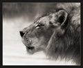
| 06/15/2009 12:05:09 PM |
Hear Me Roarby SandyPComment: He looks so smooth and silky that I want to pet him! May I keep him???? GREAT work you have done with this! Editing and composition, top notch! Curious to some editing steps. Very good! |
| Photographer found comment helpful. |
| 06/15/2009 11:50:13 AM |
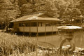
In the Japanese Gardensby Pug-HComment: For some reason I keep thinking green would've been better, but that just may be my idea of Japanese Gardens. The composition and performance couldn't have been better! |
| Photographer found comment helpful. |
| 06/15/2009 11:48:17 AM |
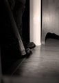
Waiting for youby CuttoothComment: Am I correct if I say that there's a man waiting for a mouse? I don't know what happened in the lower right corner of the photo, looks like you added some blur for some reason. A higher DOF would probably make the hole more obvious, and I think that would've contributed to the photo. Maybe a tad dark, but the colors are great. |
| Photographer found comment helpful. |
| 06/15/2009 11:41:21 AM |
June Gloom in Southern Californiaby jumboshrimpComment: Maybe you should've left the sky out of this photo as the slow shutter made the bright part of the sky overexposed. Cropped it or framing it otherwise would've prevented that. It could also have been sharper, and I think the tones of this picture would benefit from increasing the contrast. But it is duotones! And your idea is good, so keep it up! |
| Photographer found comment helpful. |
Home -
Challenges -
Community -
League -
Photos -
Cameras -
Lenses -
Learn -
Help -
Terms of Use -
Privacy -
Top ^
DPChallenge, and website content and design, Copyright © 2001-2025 Challenging Technologies, LLC.
All digital photo copyrights belong to the photographers and may not be used without permission.
Current Server Time: 08/21/2025 09:57:18 AM EDT.