|
|
|
Showing 1821 - 1830 of ~4592 |
| Image |
Comment |
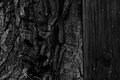
| 04/16/2011 12:31:21 PM | outsourceby posthumousComment: Greeting for the Critique Club:
Typical! First few goes at this Critique Club thing and I get one of yours! Baptism of fire (fitting then, that the wood appears charred!)
OK - time to 'fess up, I gave this a 3 in voting (I've said it now): hopefully the things I didn't like about it are the things that appeal to you.
I'll start off with what I did like - the deep blacks, they have an unusual richness about them, almost luxurious and indulgent, I quite like the white flecks of the wood too and how they suggest a constellation.
So, why the low score... It is of course a very two dimensional piece, completely minimalist in the Z axis, I feel the image acts like a bit of a wall, keeping the viewer out rather than inviting us in to explore. I wonder if the dark, dark tones compound this effect - this image feels like a no go area (no viewers allowed - move on). In voting, that's what I did - I hit you with a bit of a drive-by vote. No such copping out here though.... Being 'forced' to write a long comment is allowing me sufficient time to engage with it and I do declare, its a bit of a grower. If I think back to the challenge brief - all that stuff about light and shade and texture and form - well you've nailed all that.
One thing I do note as I look at it is that I think I would prefer it rotated 90 degrees clockwise. Years ago I had a previous life in geology and with the rotation your image offer nostalgic suggestions of rock strata - the juxtaposition of materials, tree, wood and (suggestion of) rock appeals to me.
Paul
|  Photographer found comment helpful. Photographer found comment helpful. |
| 04/16/2011 11:54:48 AM | nakedby Rino63Comment: Greeting from the Critique Club:
I was one of your 6s so I liked this well enough in voting. Your shallow depth of field, title and subject matter give the image a certain light intimacy that works well. I like the neutral light too, not at all dramatic - it adds to a sense of everyday which again adds to the intimacy because it serves to create a non-posed feel.
Your tones are spot on - quite cool but effective.
Beyond the toes you have created a sense of ambiguity - right foot on left knee (I think) but the background mystifies - I can see from the folds that it is fabric but it isn't at all clear as to how it relates to the body of the subject.
Overall, a simple but well made image.
Paul | | Photographer found comment helpful. |
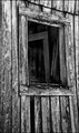
| 04/16/2011 03:27:38 AM | Nobody's Homeby Ja-9Comment: Greetings from the Critique Club:
Janine - what a pleasure to be able to offer an extended comment to one of your images. Small payback for the huge commenting commitment you offer to others. Thanks for what you do. It is very significant.
I should begin by 'fessing up and letting you know that I was one of your 4s, I can see I'm below your histogram peak so you can take these views as somewhat atypical of how your image was received more generally.
The image is well constructed: exposure, toning and contrast all serve your image well, as does the composition with the placement of the window in the frame. Although your title invites us to create a story for the image - giving the building a history, the information we have to construct the story is limited - we have no sense of scale, no sense of how this part of the building relates to the rest and noting about the world around it, you as the photographer and thus us as the viewer. In that way, the image is quite abstract, we are left only with form and structure - now that's really interesting isn't bs use the sub-text of the challenge was to create an image that communication light, shade, texture, line and form and I have to admit you've been very successful with that brief. Perhaps a title that invited consideration of the structure, what was there, rather than absent people and a back story would have helped people like me to realise what you were doing.
I don't remember the image in voting which suggest I did a drive by. Perhaps that's the issue.... Picking this up as a critique comment, like the Free Study comment series I do, forces you to stop and think but in general voting, especially in a large challenge, a visual hook to keep people long enough becomes important.
Perhaps that's harder for you to see than for most people, as one of DPC's most prolific commenters you find the time to look and comment to a much much greater extent that the rest of us. Given that you probably never do drive-by voting yourself, perhaps you don't construct images as cynically as some others - I resort to gas masks and naked models on occasion and there is a part of me that knows that such provocation at least buys me the time of the drive-by voter... Perhaps they'll then notice the light, the toning and the story....
Here then, you've made an image that meets the brief to a greater extent than most in the challenge, including my own ribboning image but it isn't one that has kept people long enough to appreciate it. I see you got two comments... I also notice that neither voted.
Anyway, I hope my words offer some insight into how voters received your image, though as I said at the beginning, I've been harsher than most.
Best regards
Paul | | Photographer found comment helpful. |
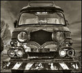
| 04/16/2011 03:00:43 AM | The eyes have it.by Bill666Comment: Greetings from the Critiques Club:
I remember this very clearly from voting, evidence that the image has impact. How could it not, it is a very bold composition with the truck looming large in the frame. I think you were to right to the potential in this particular vehicle, the array of lights fascinate. I just noticed the location, I would never have guessed this was a British vehicle - an even more remarkable find.
I'd also never have guessed this was a multiple image HDR, that's good, you've kept it subtle and all the more effective for it. Your choice of toning is well made, the slight brown tint echoing the inevitable rust.
Overall I think this is nicely seen and nicely made - I gave it a 6, slightly above your overall score. | | Photographer found comment helpful. |
| 04/15/2011 09:18:09 AM | Angel Dewiby lobrinComment: Greetings from the Critique Club:
Let me start by saying that I am a fan of model shots - I do a few myself; I quite enjoyed the image and gave it a 6 in voting. I can remember looking at it and being able to appreciate the time and trouble you had gone to. Although the overall composition obeys geometric convention, I do think you have relegated your model somewhat, placing the stone cross central to the viewer's eye and brain. Furthermore when our eyes do come to rest on the model, she is further eclipsed by the dress (and wings) because of the huge difference in luminosity. If I crop the image with my hand, losing most of the cross and putting your image into a landscape aspect ratio, with the model large in the frame, the image lifts instantly. She is your subject here, you should treat her as such.
Skills-wise, sure perhaps there is a little bit too much smoothing or noise reduction and her hair is lost into the background, but there is promise in the image - I'd love to have a play about with the RAW to see what alternatives look like - the fact that the image interests me enough to want to do that is a good thing.
Best regards
Paul | | Photographer found comment helpful. |
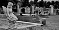
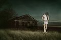
| 04/15/2011 09:07:30 AM | "He spake well who said that graves are the footprints of angels" ~Henry Wadsworth Longfeby supanovaComment: Greetings from the Critique Club:
First of all I need to 'fess up - looking at your histogram above, I was one of your 2s.You've been a victim of my prejudice of all things figurine and statuesque. I'm not alone but I'm probably among the most vehement. Now that I've said that, let me see what else I can offer...
Your aspect ratio and consequent placement of main subject is eclectic, that can work but for me I think that's best done if you can balance the composition with some compelling features in the space so created. You've pulled off elements of that - the succession of graves pulling us into the image with the communication of depth. I think your choice of depth of field works against you, making it difficult to make this very effective though, the 'SIMS' letters are apparent enough to catch our attention yet out of focus enough to frustrate. Tonally, this is quite flat - I don't know what editing tools you have available to you but I think a boost in contrast or the addition of a carefully constructed vignette would have helped to create some drama.
When I look at an image, I like to see a photographic footprint - evidence of the choices the photographer has made and to be able to appreciate the benefits of those choices. Here, the placement of the angel does reflect a clear choice (so I like that) but it hasn't left me with an impression that the choice was effective.
I'm sorry that I don't like it more but hopefully these words offer a bit of a rationale as to why.
Paul | | Photographer found comment helpful. |
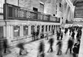
| 04/15/2011 08:43:03 AM | Don't Be Anonymousby smellyfish1002Comment: Greetings from the Critique Club:
This is a fine, fine image. The blend of sharpness and structure combined with the dynamically blurry elements makes for a most compelling juxtaposition. I'm particularly fond of the guy bottom right and how he draws the eye's attention to the wall and how the wall sends the eye into the far distance to dance across the mezzanine before hurtling back along the line of the information boards.
Your 4/10 exposure time is perfect - I'm surprised; I'd have thought it would need a little longer to get this effect; those folks must be walking with a purpose; perhaps it's 8:03 and they have a ticket for the train departing from track 103.
I'm pleased this did well. A very nicely crafted image. | | Photographer found comment helpful. |
| 04/15/2011 08:34:56 AM | Choicesby bonnettComment: Greetings from the Critique Club:
I think this is an exceptional image. Wonderful tones, bags of story and an intriguing compositional balance. I really like your use of negative space here and how your subject stares blankly into it. I also like how the image is black on the left, white on the right and grey in the centre - perhaps a visual clue that some choices aren't black and white and that the considered action may lead to a 'grey' outcome.
The pin sharp eye is especially well judged, providing an anchor point from which the eye can explore the rest of the image.
So much to like here. Good job all round. | | Photographer found comment helpful. |
| 04/15/2011 07:35:29 AM | | | Photographer found comment helpful. |
| 04/15/2011 07:16:50 AM | What We Boughtby spiritualspatulaComment: OK - I really should make a comment here. First of all, let me say that I liked this enough to give it an 8.....
I think this is 'over-made'. There's no way I'd have thought this was a live scene. I had it down as novel use of a data projector, that shadow behind the case transecting the torso, letting the background show through created that impression. I read from your notes that you wanted create a disconnect between the figure and the scene - you've achieved that, no question, but I think it has been your undoing, the image ceases to offer a feeling of authenticity. This is a shame because, the scene, the idea, the message and the choices with coloration are all bang on.
Had you chosen to stand in the scene, without the camera rotation, I suspect you'd have had an different reception entirely. Your vision, commitment and talent are unquestionable; but you made a key choice here that has cost you much higher score overall.
| | Photographer found comment helpful. |
|
Showing 1821 - 1830 of ~4592 |
Home -
Challenges -
Community -
League -
Photos -
Cameras -
Lenses -
Learn -
Help -
Terms of Use -
Privacy -
Top ^
DPChallenge, and website content and design, Copyright © 2001-2025 Challenging Technologies, LLC.
All digital photo copyrights belong to the photographers and may not be used without permission.
Current Server Time: 08/18/2025 08:52:16 PM EDT.
|