|
|
|
Showing 991 - 1000 of ~4592 |
| Image |
Comment |
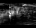
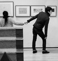
| 03/06/2013 04:57:03 PM | Aloneby NeilComment: This is a new comment series for me, so please bear with me while I find my style!
(Voted earlier)
This is one of my 9s - I like it a lot. Furthermore I think it enriches the DPC collective portfolio. Put simply, I wish we saw more stuff like this. Let me tell you why it pushes all the right buttons for me:
1. This is a really compelling image - as much because of its strangeness as anything else. I think that's because the scene is not immediately recognisable - I can't really work out 'where' we are and the social context of the scene I'm looking at - I would say a large indoor space, but that's about it.
2. I really like the motion blur and how it seems to describe an arc. Did you swing the camera and then stop to overlay a more static scene?
3. The lights over there do much for the image - once again, it is the ambiguity of their context.
4. Some of the figures are marvellous - I'm actually less drawn to your main figure and istead find my eyes alighting on the central girl in the middle with the bag and the purposeful stride.
5. The overall light in the scene - just enough to make it interesting but not enough to lose the mystery.
Overall, a really interesting offering. |  Photographer found comment helpful. Photographer found comment helpful. |
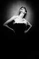
| 03/06/2013 04:47:15 PM | Anglesby JulietNNComment: 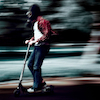
Awarded for the Best of Art 2012
This is a new comment series for me, so please bear with me while I find my style!
(Voted earlier)
This is one of my 10s - I like it very much. Furthermore I think it enriches the DPC collective portfolio. Put simply, I wish we saw more stuff like this. Let me tell you why it pushes all the right buttons for me:
1. This is flat out gallery-quality portrait work - wonderful eclectic composition, modelesque awkward pose, conspicuous structured lighting - all wonderfully contrived in a way that created photos have to be.
2. The relationship between your model and the light and the shade is just terrific, her physical relationship to it and her connection with it too.
3. The top line of her bodice - it communicates just enough of the garment she is wearing. Perfect.
4. The high contrast monochrome processing - again a perfect choice.
Overall, you've made lots of choices here and they all hang together to offer something that is more than the sum of its parts. I'd be happy to have this on my wall. | | Photographer found comment helpful. |
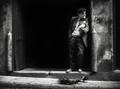
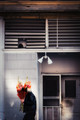
| 03/06/2013 04:34:13 PM | The Feast by jagarComment: This is a new comment series for me, so please bear with me while I find my style!
(Voted earlier)
This is one of my 10s - I like it very much. Furthermore I think it enriches the DPC collective portfolio. Put simply, I wish we saw more stuff like this. Let me tell you why it pushes all the right buttons for me:
1. John, really no one gets close to you for work like this. Many of us tried a couple of weeks ago and no one got anything like this. Your images might just be future classics.
2. For me, it's that glow you get in your image that fascinates - I've tried to emulate it and I never get it right.
3. What a character, what a scene - he's shambolically cool! With that pose, he could earn a living as a model!
4. The light is fabulous, catching his face while allowing the alcove to fall into heavy shadow.
5. The cluster of pigeons and the one on his arm are fabulously engaging and take the image beyond a 'simple' candid portrait.
Overall, you give us yet another opportunity to witness your wizardry! | | Photographer found comment helpful. |
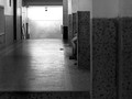
| 03/06/2013 04:23:06 PM | Teenage by TiberiusComment: This is a new comment series for me, so please bear with me while I find my style!
(Voted earlier)
This is one of my 10s - I like it very much. Furthermore I think it enriches the DPC collective portfolio. Put simply, I wish we saw more stuff like this. Let me tell you why it pushes all the right buttons for me:
1. Great, bold composition - I like how you've kept the wall on the right. I wouldn't have kept it. You were absolutely right to do so.
2. I like how this image has a great sense of depth - the textured floor and the repeating columns helps a good deal in that regard.
3. The leg of course is wonderful, it has such casualness
4. All of the above offer a sense of authenticity that I enjoy very much.
Overall, this image is marvellously uncomplicated - we get the scene that was there - it has an unembellished feel about it, furthermore - just having a glimpse of the characters in the scene offers much additional interest. Most of all though, for me, it's the way the image feels structured - it's like the structure, the form of the building has been borrowed by the photograph - almost like it's built from the building itself. Does that make sense? | | Photographer found comment helpful. |
| 03/03/2013 07:28:37 AM | this-and-that-gray-and-whiteby mariucaComment: This is a new comment series for me, so please bear with me while I find my style!
(Voted earlier)
This is one of my 9s - I like it a lot. Furthermore I think it enriches the DPC collective portfolio. Put simply, I wish we saw more stuff like this. Let me tell you why it pushes all the right buttons for me:
1. I really enjoy the relationship story here - i makes me want to watch them for a while.
2. The composition is witty and effective - particularly in how the carpeted steps merges into her top. I also like how we, as viewers, get pulled into the scene - you've included enough physical context for our brains to be easily located within in the scene - we know exactly where we are in the room.
3. Excellent monochrome treatment.
Overall, a compelling candid image. | | Photographer found comment helpful. |
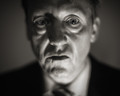
| 03/03/2013 07:24:55 AM | Intensityby MAKComment: This is a new comment series for me, so please bear with me while I find my style!
(Voted earlier)
This is one of my 9s - I like it a lot. Furthermore I think it enriches the DPC collective portfolio. Put simply, I wish we saw more stuff like this. Let me tell you why it pushes all the right buttons for me:
1. I like quirky portraits and this one certainly qualifies - you've made some really good choices here. This feels like a  rooum rooum but I'm not sure why.
2. The DOF intrigues me - I think it is lens induced - looks a bit like what I get with my 85mm f/1.2 but the fall off seems to be even greater.
3. DOF aside, where you've placed the plane of focus is just perfect - passing straight through the irises.
3. The monochrome toning is perfect - just a hit of sepia.
4. The deadpan expression of your subject is highly compelling - engaged but somehow dismissive.
Overall, a fine piece of work. | | Photographer found comment helpful. |
| 03/03/2013 07:17:14 AM | Flowersby jaysonmcComment: This is a new comment series for me, so please bear with me while I find my style!
(Voted earlier)
This is one of my 9s - I like it a lot. Furthermore I think it enriches the DPC collective portfolio. Put simply, I wish we saw more stuff like this. Let me tell you why it pushes all the right buttons for me:
1. This is a great arty image - excellent muted colours and an interesting glowing blur treatment.
2. The overall composition is a standout - the way the frame is broken up into sections is very interesting.
3. It does have a constructed look but it looks candid too - the best of both worlds.
4. The more I look, the more I want to look - that's got to be a good thing.
Overall, a very well crafted image with tons of interest. | | Photographer found comment helpful. |
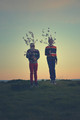
| 03/03/2013 06:57:26 AM | Sakuraby odriewComment: This is a new comment series for me, so please bear with me while I find my style!
(Voted earlier)
This is one of my 9s - I like it a lot. Furthermore I think it enriches the DPC collective portfolio. Put simply, I wish we saw more stuff like this. Let me tell you why it pushes all the right buttons for me:
1. Has an odriew feel about it - the coloration, the artsy person in the environment motif. I like it very much.
2. It's contrived - I mean that in a good way - I like how this is constructed, not accidental - the scene only exists because of you, you aren't a (near) passive reporter of the world.
3. It took me a while to realise they were jumping, I enjoyed the 'aha' moment.
4. I like how the stratified sweater mirror the stratification of colours in the sky behind.
5. The held foliage certainly works and does add interest. I did wonder whether it takes it over the edge a little - but in the end I didn't care.
Overall: A well crafted image that I have enjoyed and certainly the sort of image I'd like to see more often here at DPC. | | Photographer found comment helpful. |
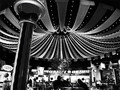
| 03/03/2013 06:47:53 AM | The Food Courtby GinaRothfelsComment: This is a new comment series for me, so please bear with me while I find my style!
(Voted earlier)
This is one of my 9s - I like it a lot. Furthermore I think it enriches the DPC collective portfolio. Put simply, I wish we saw more stuff like this. Let me tell you why it pushes all the right buttons for me:
1. I love how you've seen the potential in this scene and endeavoured to make a great photograph of it. The low light and consequent noise has no doubt given you a problem but you've brought you vision and editing skills to bear and I do believe we have an optimised image. I really like it when it's clear that photographer choices have a profound influence on what we are seeing.
2. This high contrast monochrome look is just perfect - it creates a great mood.
3. The canopy is a magnificent device in your image - it adds depth and perspective to a scene that might have otherwise been flat. The way you have framed to it and brought out its contrast is highly effective.
4. I like how you've transformed the scene - an ordinary food court now the source of vibrant night-time entertainment!
Overall - really well done, I like how 'crafted' this is. | | Photographer found comment helpful. |
| 03/03/2013 06:34:20 AM | staringby snsComment: This is a new comment series for me, so please bear with me while I find my style!
(Voted earlier)
This is one of my 9s - I like it a lot. Furthermore I think it enriches the DPC collective portfolio. Put simply, I wish we saw more stuff like this. Let me tell you why it pushes all the right buttons for me:
1. Bird shots aren't normally the sorts of images that would catch my eye when doing these types of comments, don't get me wrong - I can appreciate them, they just aren't what I'm looking for. This one is another story though. The light and the way you've used and captured it takes this to another level.
2. Fabulous texture - would've been easy to over do the structure/sharpening; but you haven't. It's perfect.
3. Super, subtle coloration - so glad it's there though. In monochrome, this would be much-diminished.
4. The 'nobility' of the bird, or at least that which you have given imbued it with is compelling.
Overall - how to do a bird study! | | Photographer found comment helpful. |
|
Showing 991 - 1000 of ~4592 |
Home -
Challenges -
Community -
League -
Photos -
Cameras -
Lenses -
Learn -
Help -
Terms of Use -
Privacy -
Top ^
DPChallenge, and website content and design, Copyright © 2001-2025 Challenging Technologies, LLC.
All digital photo copyrights belong to the photographers and may not be used without permission.
Current Server Time: 08/11/2025 03:50:57 PM EDT.
|