| Image |
Comment |
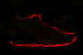
| 08/14/2015 02:43:31 PM |
Shoeby CRocheComment by sidpixel: *Hello from Sid and the Critique Club*
An original approach that meets the challenge.
I like the originality of your entry I am confident its the only one of its type in this challenge. As one of your commenters has already remarked should the shore be more or less visible? So, let's explore both approaches, if you had made the show more visible then it would have more readily fitted in with the challenge theme and perhaps achieved a higher score, who knows. Completely invisible, well then it meets the challenge in an implied sort of way which may detract voters, however done well the red light would show up better and I think it has the greater potential.
This is where the image falls down a little in that the wavy red led outline has good definition on the sole it starts to fail on the uppers and is a complete near miss on the heel. I think if you could have defined the outline more consistently throughout you would have had a much stronger image.
I must commend you for your originality, keep those creative juices flowing, Sid |
 Photographer found comment helpful. Photographer found comment helpful. |
| 08/14/2015 06:21:52 AM |
Companionsby CRocheComment by sidpixel: *Hello from Sid and the Critique Club*
An interesting still life that meets the challenge.
You have fulfilled the challenge brief with your oil in the dish and yes, you should have listened to she who is wiser and swirled it round to make it more attractive. The thing that lets the shot down the most is the softness, where it should be sharpest, the liquid looks sharp but not as sharp as it could be. I think you should have used a smaller aperture to extend your DOF to include the bread, as it is it forms a major part of the scene but is completely out of focus. Your shutter speed is very slow due to the low lighting so I am assuming you used a tripod and this may be where the problem lies, if you did not have a remote release as soon as you press the shutter release you will introduce camera shake which is what I think the underlying problems is.
I like your composition it is very enticing having made some of your commenters hungry so to that end its worked well. I am undecided about the lighting, its nice that it makes it feel more warming but the same light has turned one of your slices into toast! It has also cast some rather strong shadows that don't really add to the overall impact.
Thank you for your submission and good luck with your future entries, Sid |
| Photographer found comment helpful. |
| 07/10/2015 01:44:33 PM |
Oliviaby CRocheComment by cowboy221977: Hello from the critique club...
Stunning portrait. I think you chose your model well. The lighting is good. The backdrop works well with your model. What else can I say. Your score demonstrates that it is a good pic. Keep it up and happy shooting. |
| Photographer found comment helpful. |
| 05/19/2015 10:49:38 PM |
Oliviaby CRocheComment by grahamgator: Beautiful portrait. The eyes seem a bit soft, but still a great composition. |
| Photographer found comment helpful. |
| 05/19/2015 03:58:47 PM |
|
| Photographer found comment helpful. |
| 05/19/2015 03:12:53 PM |
Oliviaby CRocheComment by tvsometime: Very pretty and well photographed subject but I find both foreground and background colors to be problematic. voted earlier |
| Photographer found comment helpful. |
| 05/17/2015 12:10:09 AM |
Oliviaby CRocheComment by smardaz: i'm painfully aware of the beating a straight studio style portrait can take on DPC, i'm sure you're not getting the score you deserve. 7 |
| Photographer found comment helpful. |
| 05/13/2015 06:57:47 AM |
Oliviaby CRocheComment by ArnaMarie: Stunning girl and great image! Is her left hand (the one with the ring) a little bit soft compared to the rest? Regardless, its a 9 from me! |
| Photographer found comment helpful. |
| 02/03/2015 09:12:36 PM |
|
| Photographer found comment helpful. |
| 02/02/2015 02:23:30 PM |
Companionsby CRocheComment by Greensquared: I like the warmth from the lamp. It may have worked well to exclude other light sources. Greater depth of field would have helped complete the visual aspects as well. |
| Photographer found comment helpful. |
Home -
Challenges -
Community -
League -
Photos -
Cameras -
Lenses -
Learn -
Help -
Terms of Use -
Privacy -
Top ^
DPChallenge, and website content and design, Copyright © 2001-2026 Challenging Technologies, LLC.
All digital photo copyrights belong to the photographers and may not be used without permission.
Current Server Time: 07/18/2026 02:58:43 AM EDT.