| Author | Thread |
|
|
01/16/2004 08:39:26 AM |
Now that you've finished with my money can I have it back?
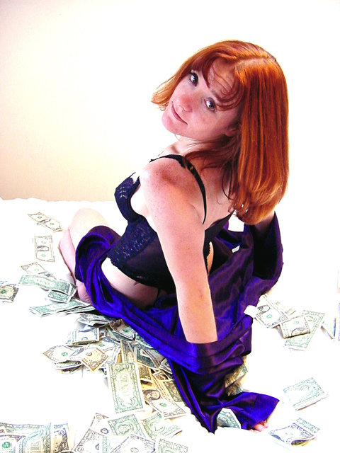
Great picture.I agree that a slightly darker spread would have been better.Have you tried the shot in B/W ? Can we see more of Emma ?
Love the colour of her hair, it would look great in the sunlight. |
|
|
|
11/19/2003 02:13:52 PM |
i think that if you tried a light feathered edge around the washed out spots to the lower right and left, that might solve your lightness problem and give it a little dreamy effect and shift the focus even more to emma and the money under her. or would that be too campy?
about emma's wrinkled forehead: that's a much more natural and seductively innocent expression than if you told her to try not to raise her eyebrows as she gives the ''come hither'' look. people tend to get hung up too much on wrinkles as a sign of aging, and if you're stuck on that then i guess you can argue that the wrinkles are a foreshadowing of the premature aging that will come with a loose lifestyle.
but i really believe that seeing an attractive young woman make her forehead wrinkle can be seductive, playful, and even beatiful, and can tell a story. [i would've liked it if emma's wrinkles had a more even pattern, but that's up to nature, and she's _really_ pretty no matter what. ;] ] so i think telling the model to change her expression or pose to avoid forehead wrinkles or brushing down bangs to try to hide them or worse airbrushing them or editing them away is a disservice.
joe
|
|
 Photographer found comment helpful. Photographer found comment helpful. |
|
|
12/14/2002 07:39:57 PM |
I ran into this pic again and I remembered it from the challenge. Yes, sex sells, but besides that it is also a great pic. I like the exposure, your friend Emma really stands out. The hair, skin tones, the blue of the lingerie and subject shadow detail are captured.
The wall on the upper right balances very well with the hair, while the edge between the wall and the bedd adds perspective. Because the right side is blown out exposurewise all focus is on Emma. The way the money is distributed over the bed (could use the wrong word there, English is not my first language) adds depth.
Her position is very good. Original and giving a good profile, definitely creating a feeling of lust (altough I will not pay). :-)
To come back on the exposure, I think you did a good job. The main subject is really good, the overexposure on the right and around the money is a justified tradeoff.
|
|
| Photographer found comment helpful. |
Comments Made During the Challenge  |
|
|
10/20/2002 04:44:00 PM |
| the bed is a little overexposed for my liking but the concept is nice |
|
| Photographer found comment helpful. |
|
|
10/20/2002 03:34:00 PM |
| Super blow-out, and that blue is electric! |
|
|
|
10/20/2002 12:25:00 PM |
| She STILL doesn't look like a hooker! |
|
|
|
10/20/2002 12:43:00 AM |
| I'd call this soft porn and you are calling her a whore. |
|
|
|
10/18/2002 01:14:00 PM |
| Very nicely done. The washed out background really complements the model and the colors of her hair and clothing. Very tastefully done. 8, mcrael |
|
| Photographer found comment helpful. |
|
|
10/18/2002 12:36:00 PM |
first impression -- this looks like wonder in wonderland with shorter hair. mag99, is this your shot? love the angle and how the bed and money looks high-key while the girl doesn't.
challenge -- met
technical -- well done, some uneven light on the wall (right side melts into the bed, left has definite difference in color) but overall great
composition -- very nice with the unusual angle from above and her turning back to look up. wish she wasn't wrinkling her forehead like that, but that's nitpicky.
overall -- 8 from gr8photos |
|
| Photographer found comment helpful. |
|
|
10/18/2002 08:41:00 AM |
Composition: Subject Placement, Cropping, Background7,
Technical: Focus, Exposure, Lighting, Processing7,
Appeal: Is it Interesting, Motivating, Etc.? 8,
Total Averaged Rating7. Autool
|
|
| Photographer found comment helpful. |
|
|
10/17/2002 08:11:00 PM |
| Like the positioning of the model and money. Tells the story beautifully.(7) |
|
|
|
10/17/2002 03:37:00 PM |
| darker bedspread next time maybe. |
|
|
|
10/17/2002 03:06:00 PM |
|
|
|
10/17/2002 11:25:00 AM |
| Like the angle of the model, very nice lighting. 8-Martin |
|
|
|
10/16/2002 06:47:00 PM |
| I like the exposure, and the composition. Moderate impact for me. lhall |
|
|
|
10/16/2002 05:55:00 PM |
| hehe, great idea! the overblown lighting works really well here--it makes the colors blue and the red hair really stand out. nice work. 9--alecia |
|
| Photographer found comment helpful. |
|
|
10/16/2002 05:20:00 PM |
| Got change for a $5?? The bed is a little bright. If there was no border around the shot, it would be lost in the background. |
|
| Photographer found comment helpful. |
|
|
10/16/2002 05:02:00 PM |
|
|
|
10/16/2002 04:57:00 PM |
| Good idea. Wouldn't it be more appropriate to be darker, considering the sin? Also, I think this woman would be worth more than just $1 bills. Plus, she doesn't look trashy enough to be a prostitute. That should be a compliment to your model. |
|
| Photographer found comment helpful. |
|
|
10/16/2002 02:33:00 PM |
|
|
|
10/15/2002 08:45:00 PM |
| Very expressive look on the models face. The bills are a little overexposed, but that kind of adds a detachment quality. Very well done... ~MyQyl~ |
|
| Photographer found comment helpful. |
|
|
10/15/2002 08:25:00 PM |
| I'm a sucker for Red Heads! -8 |
|
|
|
10/15/2002 05:23:00 PM |
| Looks like about $50, kinda cheap, don't you think? Looks more like $200 or so. Really nice photo! Very effective shot. Pretty good color, but in places seems over exposed (leg, some of the bills - {ALL SINGLES!}) Don't worry!!! 9 Swash |
|
| Photographer found comment helpful. |
|
|
10/15/2002 03:38:00 PM |
| like someone will actually pay for THAT?? |
|
|
|
10/15/2002 12:22:00 PM |
|
|
|
10/15/2002 07:28:00 AM |
| Great picture! Good pose and cocept. The money is slightly over exposed but the other colours are great |
|
| Photographer found comment helpful. |
|
|
10/15/2002 06:10:00 AM |
| This is a good attempt. Could be pride, envy, lust, or greed. Great job! |
|
| Photographer found comment helpful. |
|
|
10/15/2002 01:08:00 AM |
| Very nicely done. 10. byetko. |
|
| Photographer found comment helpful. |
|
|
10/14/2002 10:16:00 PM |
|
|
|
10/14/2002 09:31:00 PM |
| Composition: Subject Placement, Cropping, Background 7 , Technical: Focus, Exposure, Lighting, Processing 6 , Appeal: Is it Interesting, Motivating, Etc.? 5 , Total Averaged Rating 6 . smshats |
|
| Photographer found comment helpful. |
|
|
10/14/2002 07:35:00 PM |
| Good use of color contrast. |
|
|
|
10/14/2002 07:07:00 PM |
| Good effort with a cliche shot. 5/10 |
|
|
|
10/14/2002 06:32:00 PM |
| Great concept, pose and framing. Just too bright around the money. Makes it too hard to see what it is. 8 - floyd |
|
| Photographer found comment helpful. |
|
|
10/14/2002 12:10:00 PM |
| Good concept... need more contrast... |
|
| Photographer found comment helpful. |
|
|
10/14/2002 10:25:00 AM |
| Pretty obvious. The photo just tries too hard. |
|
|
|
10/14/2002 04:21:00 AM |
| Not crazy for the lighting. Love her, love the hair, the robe, very nice. Cute girl and creative idea. Nice job. Good luck Justine |
|
| Photographer found comment helpful. |
|
|
10/14/2002 01:09:00 AM |
| now i like freckles and all but the bottom part of the image is a little light along with the background--i think i know your concept though--7bobgaither |
|
| Photographer found comment helpful. |
Home -
Challenges -
Community -
League -
Photos -
Cameras -
Lenses -
Learn -
Prints! -
Help -
Terms of Use -
Privacy -
Top ^
DPChallenge, and website content and design, Copyright © 2001-2024 Challenging Technologies, LLC.
All digital photo copyrights belong to the photographers and may not be used without permission.
Current Server Time: 04/27/2024 06:01:35 AM EDT.