| Author | Thread |
|
|
08/09/2012 10:01:07 AM |
That's a low score?
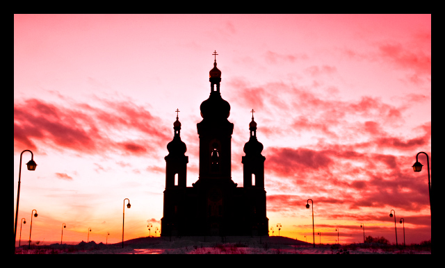
I would suggest doing perspective correction on this. Either the side lamp posts should be straight, or you could lose them altogether. |
|
 Photographer found comment helpful. Photographer found comment helpful. |
|
|
07/31/2012 12:31:02 PM |
Originally posted by bassbone:
Originally posted by LanndonKane:
this is interesting. im finding it very difficult to see the softness in this image. in fact, it is sharpened to the max; any more sharpening and there would be jaggies all over. is the softness mostly in the clouds, or the building itself? |
Maybe I mis-spoke when I wrote 'halo'. Rather, I see almost a double edge to all the surfaces, as if the image was not sharp to start and that you sharpened post photography to make the edges sharp. The lamps look as though they have a ghost image almost superimposed but not quite. The same is true of the temple edges. The edges of all the dark surfaces are just not sharp.
My guess this has to do with the optics of the lens and could not be fixed in post processing. |
thanks very much. i think i see what you're talking about. |
|
|
|
07/31/2012 12:14:01 PM |
Originally posted by LanndonKane:
this is interesting. im finding it very difficult to see the softness in this image. in fact, it is sharpened to the max; any more sharpening and there would be jaggies all over. is the softness mostly in the clouds, or the building itself? |
Maybe I mis-spoke when I wrote 'halo'. Rather, I see almost a double edge to all the surfaces, as if the image was not sharp to start and that you sharpened post photography to make the edges sharp. The lamps look as though they have a ghost image almost superimposed but not quite. The same is true of the temple edges. The edges of all the dark surfaces are just not sharp.
My guess this has to do with the optics of the lens and could not be fixed in post processing. |
|
| Photographer found comment helpful. |
|
|
07/31/2012 11:52:23 AM |
| this is interesting. im finding it very difficult to see the softness in this image. in fact, it is sharpened to the max; any more sharpening and there would be jaggies all over. is the softness mostly in the clouds, or the building itself? |
|
|
|
07/31/2012 11:49:00 AM |
| A very nice image with great color and composition, the sharpness lets it down a lot and the border is an acquired taste, even with the border if this had been sharp it would have scored way higher. |
|
| Photographer found comment helpful. |
|
|
07/31/2012 11:43:39 AM |
Originally posted by bassbone:
First of all - isn't it amazing how small the images look using the old 640 pixel requirement!?
Regarding the photo at hand, the colors of the sunrise are wonderfully rich and the use of centered composition really focuses our attention on the temple. That said, I fear that the image does not come off as sharp, especially around the temple. There is almost a small amount of halo around the entire image that makes it seem not completely in focus.
The thick border also seems to take away from the image, from the lightposts are cut off abruptly to the foreground glow lost in the thick black of the frame. |
thank you, very interesting, can't even see the halo. |
|
|
|
07/31/2012 11:41:52 AM |
First of all - isn't it amazing how small the images look using the old 640 pixel requirement!?
Regarding the photo at hand, the colors of the sunrise are wonderfully rich and the use of centered composition really focuses our attention on the temple. That said, I fear that the image does not come off as sharp, especially around the temple. There is almost a small amount of halo around the entire image that makes it seem not completely in focus.
The thick border also seems to take away from the image, from the lightposts are cut off abruptly to the foreground glow lost in the thick black of the frame. |
|
| Photographer found comment helpful. |
Comments Made During the Challenge  |
|
|
02/25/2008 06:48:01 PM |
| its cool how you almost have a level angle when you took it. |
|
| Photographer found comment helpful. |
|
|
02/24/2008 07:59:09 PM |
| Nice shot. The composition and colors speak out loud. |
|
| Photographer found comment helpful. |
|
|
02/24/2008 07:24:47 PM |
|
| Photographer found comment helpful. |
|
|
02/23/2008 07:10:34 PM |
| good picture, the only thing i have to say is that maybe you should try not putting the picture in the middle, there is just to much space on the sides. |
|
| Photographer found comment helpful. |
|
|
02/23/2008 05:09:16 PM |
| Wow what a sunrise...was a filter used? |
|
| Photographer found comment helpful. |
|
|
02/23/2008 03:49:59 PM |
|
| Photographer found comment helpful. |
|
|
02/23/2008 12:23:03 AM |
| wow this is really beautiful. amazing colors! |
|
| Photographer found comment helpful. |
|
|
02/22/2008 03:23:18 PM |
| I love this sky, and that the temple is the main focus and it stands out because it is dark. This photograph just seems very calming. |
|
| Photographer found comment helpful. |
|
|
02/22/2008 11:31:28 AM |
|
| Photographer found comment helpful. |
|
|
02/22/2008 11:02:03 AM |
| My eyes keep going to the lamps all around. Not the building. |
|
| Photographer found comment helpful. |
|
|
02/22/2008 08:40:18 AM |
| Nice colours in the sky ... I think using the unsharp mask tool would improve the picture slightly |
|
| Photographer found comment helpful. |
|
|
02/21/2008 09:52:06 PM |
| Nice. Centered compositions are usually too static for me but this is fine for a challenge with this theme. |
|
| Photographer found comment helpful. |
|
|
02/21/2008 07:14:47 PM |
| Great colours here, overall effect is very appealing. |
|
| Photographer found comment helpful. |
|
|
02/21/2008 09:24:03 AM |
| really good picture the background is what makeds this picture |
|
| Photographer found comment helpful. |
|
|
02/20/2008 07:47:39 PM |
You mean dusk don't you. Unless the world has done a complete flip flop :D
Nice capture great silhouette. Good luck |
|
| Photographer found comment helpful. |
|
|
02/20/2008 04:56:41 PM |
| A bit busy and saturated. But I like the colours and the silhouette. 6 |
|
| Photographer found comment helpful. |
|
|
02/20/2008 12:46:34 PM |
| I thin an off-center copaosition would strengthen this - maybe chop off a bit of the left so that the temple is in the thirds position. |
|
| Photographer found comment helpful. |
|
|
02/20/2008 12:28:27 PM |
| I find the lamps on the foreground edges distracting. |
|
| Photographer found comment helpful. |
|
|
02/20/2008 12:48:20 AM |
|
| Photographer found comment helpful. |
Home -
Challenges -
Community -
League -
Photos -
Cameras -
Lenses -
Learn -
Prints! -
Help -
Terms of Use -
Privacy -
Top ^
DPChallenge, and website content and design, Copyright © 2001-2024 Challenging Technologies, LLC.
All digital photo copyrights belong to the photographers and may not be used without permission.
Current Server Time: 05/04/2024 12:59:56 AM EDT.