| Author | Thread |
|
|
05/09/2007 02:14:21 PM |
| I think this shot is pretty neat. With your comments above, I would be interested to see what the close up shot of the bubbles looks like. If the challenge is "bubbles" you could have probably gotten away with it & everyone would know what it was. I like how the subject isn't centered in the picture & I love the bright blue color. Maybe a little tighter crop could have worked, but I see you had to leave a lot in so people would know what it was. I am new to editing pictures so that is about all I can offer :) Keep up the good work. |
|
 Photographer found comment helpful. Photographer found comment helpful. |
|
|
05/06/2007 12:48:56 PM |
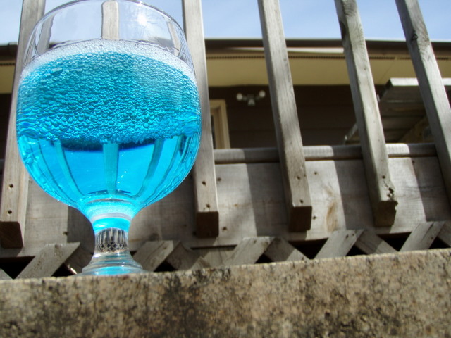
The best thing about your image is the reflection of the deck in the glass.....grats on your new PB
Jeff
|
|
| Photographer found comment helpful. |
|
|
05/02/2007 02:36:29 PM |
i think it kinda works
Keep shooting
Kev |
|
| Photographer found comment helpful. |
|
|
05/02/2007 11:24:58 AM |
Originally posted by RPvanderHilst:
I find it annoying that the surroundings are only just out of focus, instead of either in focus or totally unsharp. However, that IS original :P |
That was due to my laziness mostly, so I couldn't blame you for voting me down on that. XD
Originally posted by star155:
I like the concept, it would be better with a background that relates. For example, a bar or high counter top. |
I chose this background because as you can see, the distortion of the deck and the lattice show inside the glass. I found them the most interesting pattern, but I understand what you're saying.
Originally posted by Shaman:
I find the background here very distracting. great colour in the liquid, tho. In a dark studio set-up, using the same upwards angle and lighting on the glass, this would have been a 7 or 8. now 5 |
As I said above, in a different setting the distorted patterns wouldn't be there, and that was what I was mainly focusing on.
|
|
Comments Made During the Challenge  |
|
|
05/01/2007 09:14:27 PM |
| I like the concept, it would be better with a background that relates. For example, a bar or high counter top. |
|
| Photographer found comment helpful. |
|
|
05/01/2007 08:43:12 PM |
| I love the bright blue that makes the glass pop out, as well as the distortion in the picture. Nice. |
|
| Photographer found comment helpful. |
|
|
05/01/2007 01:24:36 PM |
| I find the background here very distracting. great colour in the liquid, tho. In a dark studio set-up, using the same upwards angle and lighting on the glass, this would have been a 7 or 8. now 5 |
|
| Photographer found comment helpful. |
|
|
04/30/2007 02:37:13 PM |
| I find it annoying that the surroundings are only just out of focus, instead of either in focus or totally unsharp. However, that IS original :P |
|
| Photographer found comment helpful. |
|
|
04/27/2007 09:42:44 AM |
| i like the colors and your use of bubbles AND rule of thirds! |
|
| Photographer found comment helpful. |
|
|
04/25/2007 01:05:14 PM |
|
| Photographer found comment helpful. |
Home -
Challenges -
Community -
League -
Photos -
Cameras -
Lenses -
Learn -
Prints! -
Help -
Terms of Use -
Privacy -
Top ^
DPChallenge, and website content and design, Copyright © 2001-2024 Challenging Technologies, LLC.
All digital photo copyrights belong to the photographers and may not be used without permission.
Current Server Time: 05/13/2024 11:53:34 PM EDT.