| Author | Thread |
|
|
10/29/2004 09:26:52 AM |
B.O.T.P.A.C.
Bottom of the Pack Analytical Comments
Every challenge I am going to leave comments on some of the photos that finished at the bottom of the pack. I will try and explain why I think the photo did not do well in the challenge, which will hopefully result in increased rankings in your future photos.
-Ben
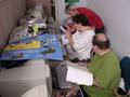
1) This photo does not immediately fit the challenge without an explaination. The photo should speak for itself and not rely on an explaination. It may fit the challenge if people think about it for long enough, but with 200 photos to vote on, most people will only look at your photo for a few seconds before deciding it doesnt meet the challenge and moving on.
2) Clarity. Your photo isn't sharp, which is what a lot of voters look for when scoring a photo.
3) Composition. It is very cluttered. Most voters prefer simply composed photos which draw attention to the focal point. This photo doesn't seem to have a focal point.
4) Title. If people don't understand the photo, most will then look at the title to see of that helps. In this case the title wouldn't be understood by most, if not all, voters.
5) Post Processing. The photo has a blue tint to it which isn't natural. A lot of voters like the photos to look as natural, and be as technically perfect, as possible. It looks like you used the wrong white balance, which is why a lot of people would have voted you down.
Message edited by author 2004-10-29 09:30:43. |
|
Comments Made During the Challenge  |
|
|
10/25/2004 03:19:42 AM |
| you've lost me on this one |
|
|
|
10/23/2004 02:48:23 PM |
| I'd have liked to have seen this a bit sharper with perhaps a bit more brightness. It so looks like my daughter idea of homework time though that I'm going to give it 7. |
|
 Photographer found comment helpful. Photographer found comment helpful. |
|
|
10/22/2004 01:26:41 PM |
| Seems a bit cluttered to me, and the colors are way too blue-ish. |
|
| Photographer found comment helpful. |
|
|
10/21/2004 05:43:05 PM |
| Very interesting, a little too cluttered. |
|
| Photographer found comment helpful. |
|
|
10/21/2004 02:19:29 PM |
| I dont see "School days" at all |
|
|
|
10/21/2004 01:12:20 AM |
| Is this what reminds you of school?? Skip out on Organization 101?? Just kidding. Nice idea. |
|
| Photographer found comment helpful. |
|
|
10/20/2004 09:07:36 PM |
| pretty good job on focus, but too green and backround is kinda cluttered. Imaginative artwork! |
|
| Photographer found comment helpful. |
|
|
10/20/2004 08:27:31 AM |
Nice image but it's a bit too green. Try balancing the white on your camera when shooting in the office.
|
|
| Photographer found comment helpful. |
|
|
10/20/2004 02:13:57 AM |
| It is actually quite scary... I also like the mess on the table. Interesting. |
|
| Photographer found comment helpful. |
|
|
10/20/2004 12:35:36 AM |
| i know what that key chain says, and that's not very nice. ;o) |
|
| Photographer found comment helpful. |
Home -
Challenges -
Community -
League -
Photos -
Cameras -
Lenses -
Learn -
Prints! -
Help -
Terms of Use -
Privacy -
Top ^
DPChallenge, and website content and design, Copyright © 2001-2024 Challenging Technologies, LLC.
All digital photo copyrights belong to the photographers and may not be used without permission.
Current Server Time: 05/17/2024 09:43:00 AM EDT.