| Image |
Comment |
| 04/07/2003 12:32:27 AM |
Melbourne Skyline by GordonComment: I'm very glad to see this shot take a ribbon. It's beautiful. Congratulations on the win! |
 Photographer found comment helpful. Photographer found comment helpful. |
| 04/06/2003 10:58:40 PM |
Candy Landby SonifoComment: So simple, yet, so well done. My only suggestion would be to flip the top center blue candy around so it spins the same direction as the others. (I'm the only one on the planet that would notice that though). Great shot - 10 |
| Photographer found comment helpful. |
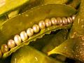
| 04/02/2003 01:28:56 AM |
Fresh Sugar Snap Pearlsby GraciousComment: This is just beautiful, interesting, artistic & cleaver. The water is a great addition. My only suggestion would be to diffuse the lighting on the pearls, but it also might hurt the detail in other spots. This is a 10 |
| Photographer found comment helpful. |
| 03/18/2003 08:47:33 PM |
Looking down on San Antonioby xertionComment: This is a very clear photograph. The rotation is out to the right slightly +/- 1%. The angle of lighting is from the left front causing the sky to appear washed out. This would be corrected if the light were from behind you and would give you a uniform blue sky. |
| Photographer found comment helpful. |
| 02/18/2003 01:20:13 AM |
yellow fork trioby shutterflyComment: A good shot, simple, but effective at holding my attention. The shadows are casting a rounded background, but there is a corner showing too. I'm not sure it needs to be there. A tiny distraction with the subjects slightly out of center. The yellow border is a nice touch. |
| Photographer found comment helpful. |
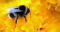
| 02/18/2003 01:10:56 AM |
His Favourite color by HoogieComment: Wow, now that's yellow. I love the reflection on the wings, it makes them stand out. The detail is great. Nice crop/placement. The depth of field is perfect for bringing the attention to the bee. A couple of spot/flaws on the flower could be removed after the contest, but this is a great shot. |
| Photographer found comment helpful. |
| 02/18/2003 12:49:45 AM |
Here Comes The Sunby TerryGeeComment: wow this is good. Simple, bright and all in focus. I even like the border. (I'm not sure it can be improved)There is one small flaw spot in the center part of the flower that i guess could be touched up, but it is a part of the flower.... Its just up from center and just left of center. A great shot TerryGee. Message edited by author 2003-03-14 13:47:17. |
| Photographer found comment helpful. |
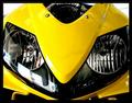
| 02/17/2003 11:46:13 AM |
CBR Nose Coneby EnzoComment: This is so clean and bright I like it, but I can't tell what it is. Honda.... motorcycle? I think I'd like to see more of it. One distraction to me is what looks like a broken pinstripe within the border on the top and left sides. It seems to follow the image to some degree, but I don't see it on the bottom or the right side??? I'm not sure if it was intentional. I do like this picture alot it is one of the best. |
| Photographer found comment helpful. |
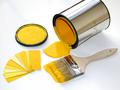
| 02/17/2003 11:24:18 AM |
Decisions, Decisions !by BitzComment: This looks like a promo shot. It’s very well done. One tiny irritant is the shadow in the upper left being cast into the picture. The shape and direction of the shadow make me wonder what’s up there. |
| Photographer found comment helpful. |
| 02/17/2003 11:13:59 AM |
Yell Ohh...by tfarrell23Comment: Wow this is cleaver. It certainly shows “yellow” I like that that the main subject is not centered, but I feel like you may have taken him just a bit too far off the page. I think I’d like to see the rest of his hand and/or the collar on his shirt. It just feels a little crowded to me. But I do like it a lot. |
| Photographer found comment helpful. |
Home -
Challenges -
Community -
League -
Photos -
Cameras -
Lenses -
Learn -
Prints! -
Help -
Terms of Use -
Privacy -
Top ^
DPChallenge, and website content and design, Copyright © 2001-2024 Challenging Technologies, LLC.
All digital photo copyrights belong to the photographers and may not be used without permission.
Current Server Time: 04/28/2024 08:45:20 PM EDT.