| Author | Thread |
Comments Made During the Challenge  |
|
|
03/05/2012 04:26:42 PM |
|
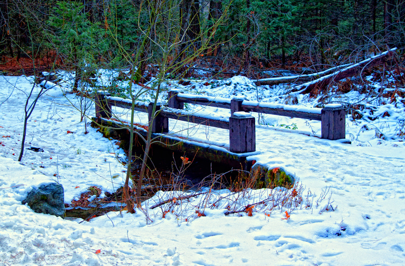
A beautiful little scene, which a bit too much over processing for me. |
|
|
|
03/03/2012 02:47:30 PM |
|
The color is off on this. It is very blue! I do like the centered composition of the bridge. |
|
|
|
03/01/2012 10:26:22 AM |
Being that this is the first picture I am choosing to vote on/comment on, I may come back and bump up my vote...
As for the comment:
I like this picture. It evokes a "coldness". Perhaps that due to the blue tinging... the colors are over saturated, which works well in this picture. It gives it a very vibrant look. I, personally, like pictures that are overly saturated, or under saturated... makes me think more.
I like the detail that is here as well. Especially when looking at the rocks just below the front of the bridge.. the snow covering them. It's very sharp. Very detailed. Great shot! :) |
|
|
|
03/01/2012 09:47:39 AM |
|
I find the colour cast on this photo to be really off putting. Not sure if this was done in processing, or in camera, but the colours are definitely off. The wood has a purple tone, the snow is too blue and the tree branches look unnaturally green. Is it possible you monitor is not calibrated correctly? Do you saturate this image? |
|
Home -
Challenges -
Community -
League -
Photos -
Cameras -
Lenses -
Learn -
Help -
Terms of Use -
Privacy -
Top ^
DPChallenge, and website content and design, Copyright © 2001-2026 Challenging Technologies, LLC.
All digital photo copyrights belong to the photographers and may not be used without permission.
Current Server Time: 06/29/2026 10:41:13 PM EDT.