|
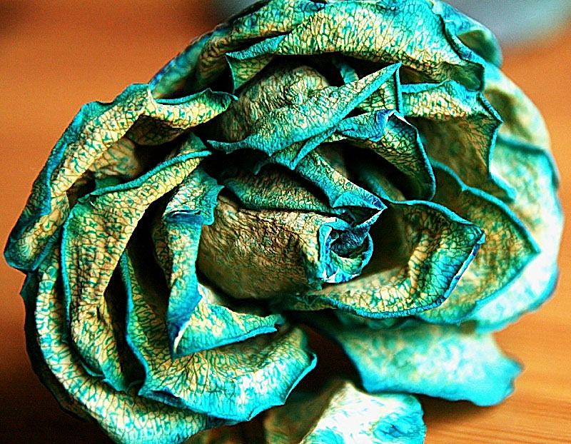
Great colors, love the high contrast and crisp detail. (I think you could have used a somewhat narrower aperture to good effect so that you could get more of the crunchy dried-out-ness good and razor-sharp.) The lower right is all dead area, though--if you'd burned that down to tones closer to the upper left, I think you'd have a much better balanced image that creates a stronger focus on the center of the rose. |





 Add photograph to your favorites
 Add photographer to your favorites

 Photographer found comment helpful.
