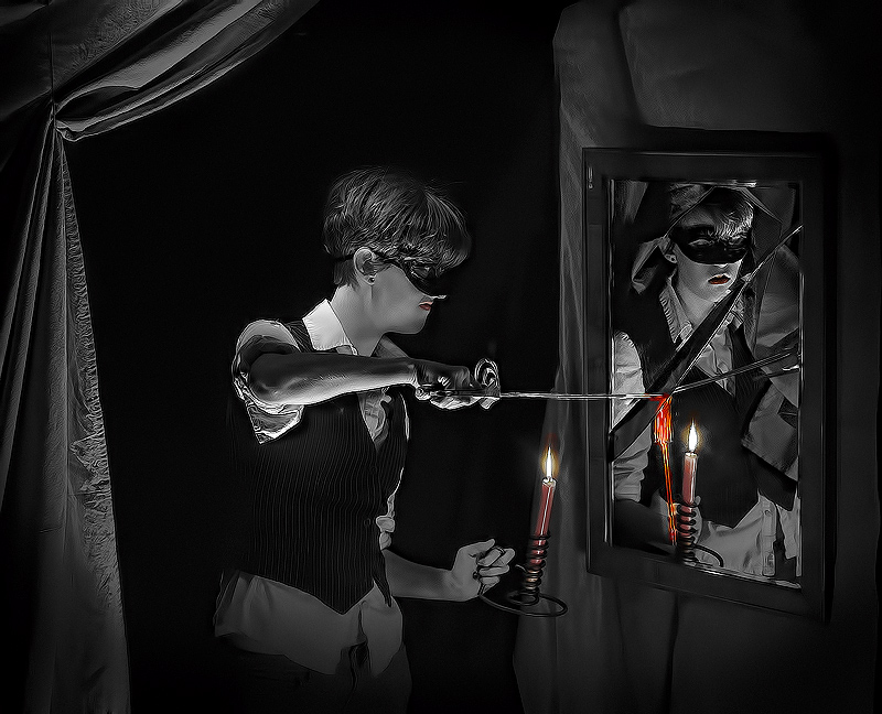
I was trying to go for the look of an engraving with the B&W and over sharpening to go with a graphic that might be of the era, but I probably missed the mark. Now I like the out-take better
Statistics
Place: 22 out of 88 Avg (all users): 6.3923 Avg (commenters): 8.5000 Avg (participants): 5.9545 Avg (non-participants): 6.6163 Views since voting: 1034 Views during voting: 285 Votes: 130 Comments: 4 Favorites: 0
I really like this although I think the oversharpening halos detract somewhat. However it is well staged and well lit, with judicious use of selective colour - overall a well conceived and interesting illustration.






 Add photograph to your favorites
 Add photographer to your favorites


 Photographer found comment helpful.


