| Author | Thread |
Comments Made During the Challenge  |
|
|
08/20/2004 02:01:57 AM |
|
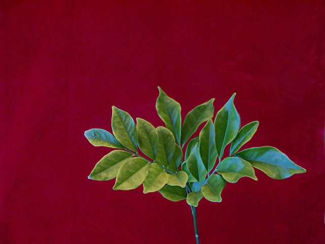
nice use of complementary colors... the plant doesnt look real for some reason imo. |
|
 Photographer found comment helpful. Photographer found comment helpful. |
|
|
08/18/2004 09:45:39 PM |
|
I like this picture but the composition throws me off a bit .. first I wish it was more straight (the stem) then then maybe up higher (the plant) |
|
| Photographer found comment helpful. |
|
|
08/17/2004 04:32:20 PM |
|
The color combination makes this a stand-out for me. BOL |
|
| Photographer found comment helpful. |
|
|
08/16/2004 09:32:21 PM |
|
A wonderfully simple idea - executed with elegance and style. I'm impressed by how well your choice of background colors works. Very nice. |
|
| Photographer found comment helpful. |
|
|
08/16/2004 02:45:01 PM |
|
Good technical capture but composition is weak. Odd color for a background but the color wheel contrast with the green makes it pop a bit. |
|
| Photographer found comment helpful. |
|
|
08/16/2004 06:00:59 AM |
|
Red background overpowers the more diminutive and less saturated colored plant. Would have liked to have seen you use a less bold background color for this plant. Need to see more detail in the leaves. |
|
| Photographer found comment helpful. |
Home -
Challenges -
Community -
League -
Photos -
Cameras -
Lenses -
Learn -
Help -
Terms of Use -
Privacy -
Top ^
DPChallenge, and website content and design, Copyright © 2001-2026 Challenging Technologies, LLC.
All digital photo copyrights belong to the photographers and may not be used without permission.
Current Server Time: 07/01/2026 10:18:32 AM EDT.