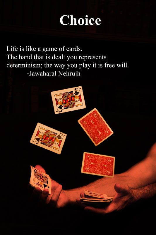
This is great, I like the lighting and the card trick! My only complaint is the balance of the words, maybe if the word "choice" was centered above the slogan or vise versa, or bigger across the top, or one on top & one on bottom.. can't decide. the font goes well...Good job on the image!...7
This would be a top contender for me but there is a "yellowness" or "red sheen" for lack of a better word over the whole shot, it lacks the clarity that could have been achieved in processing to make it visually stunning to match the message. It is still very good, perhaps not the top few- but I have been wrong before. good luck.
The yellow cast of the lighting steals much of the vibrancy in the cards, and the pure white of the text reinforces that cast. If you couldn't color correct, coloring the text to match might have helped.





 Add photograph to your favorites
 Add photographer to your favorites


 Photographer found comment helpful.


