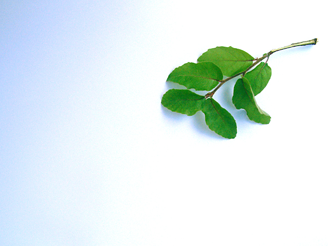
I think the levels of blue are too high in the shadows. - you can even see where the green would be crisper without it.
otherwise a simple negative space effect, but I am left wondering where the wow factor is. could have some usefulness as a stock photo - perhaps.
Simple is a good idea. I wish leaves were a little sharper - more detailed. Backlighting can give more detail in leaves. The blue shadows are a biit odd particularly the shadowon the top left. An even and empty background would work better.
Good workmanlike image. I can clearly see it in a magazine ad, for example, with text in the large white spaces. But as a stand alone image, there is too little going on to sustain my interest.






 Add photograph to your favorites
 Add photographer to your favorites


 Photographer found comment helpful.


