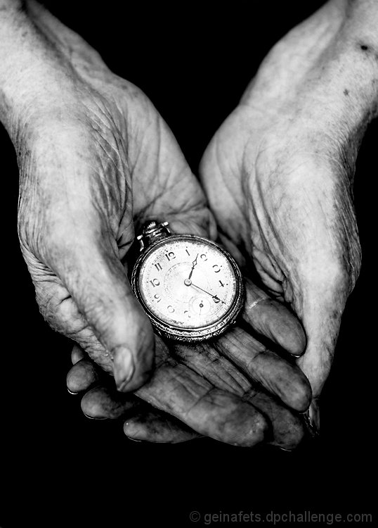
I have no idea when the watch was made, but those hands were made in 1927.
Shortly after I took this image, I figured out how to change the time on the watch. I set it to various times, mostly ones that correlate with important dates, but those images didn't turn out as well as this one did.
One of my WPL team members already mentioned that the thumb is a bit OOF, and I'd bet that I'll get more comments on it. The only excuse I have is that I think I'm allergic to apertures smaller than 2.8.
Editing:
- Curves: Dragged the low point up to darken the background completely. This also emphasized the wrinkles, skin marks, and shadows.
- Crop: Cropped the tiniest bit from the left to center it more and a bit from the bottom.
- USM
- Black and White conversion: Darkened the reds a lot and lightened the yellows a little.
- Curves: Just a touch to lighten the brighter tones on the watch face and hands.
- Resize
[Aug. 21st, 2011 08:41:26 PM]
I've gotten a few comments about the watch's face being a bit too bright. I did that on purpose because I've become a bit particular about making sure that the tones cover the whole spectrum from the blackest blacks to the whitest whites in every image. I guess I went overboard here! I'll keep that in mind in the future.
As for being predictable, I think it worked in my favor in this instance, judging by the score. When working to please people (either the public or clients), it's usually best to go a bit on the conservative side in terms of ideas because not everyone can stretch their minds quick enough to grasp "out-there" concepts. That's ok. I just choose to keep that in mind when shooting, for better or worse.
Statistics
Place: 13 out of 130 Avg (all users): 6.1420 Avg (commenters): 8.2000 Avg (participants): 5.7742 Avg (non-participants): 6.3700 Views since voting: 946 Views during voting: 274 Votes: 162 Comments: 11 Favorites: 0
I like this a lot. I do think the face of the watch is a bit over-bright and we lose some details on the blacks. Also I migth have suggested a narrower DOF to keep the entire hand in focus (were I awake). But what an evocative photo!
The photo is very well processed and emotive. The title detracts from the emotion felt. But I am voting on the picture and not the title in this case because the title is not being used to shoehorn the photo into fitting the challenge.





 Add photograph to your favorites
 Add photographer to your favorites

 Photographer found comment helpful.


