| Author | Thread |
Comments Made During the Challenge  |
|
|
07/20/2011 04:08:34 AM |
|
 Photographer found comment helpful. Photographer found comment helpful. |
|
|
07/18/2011 10:53:53 AM |
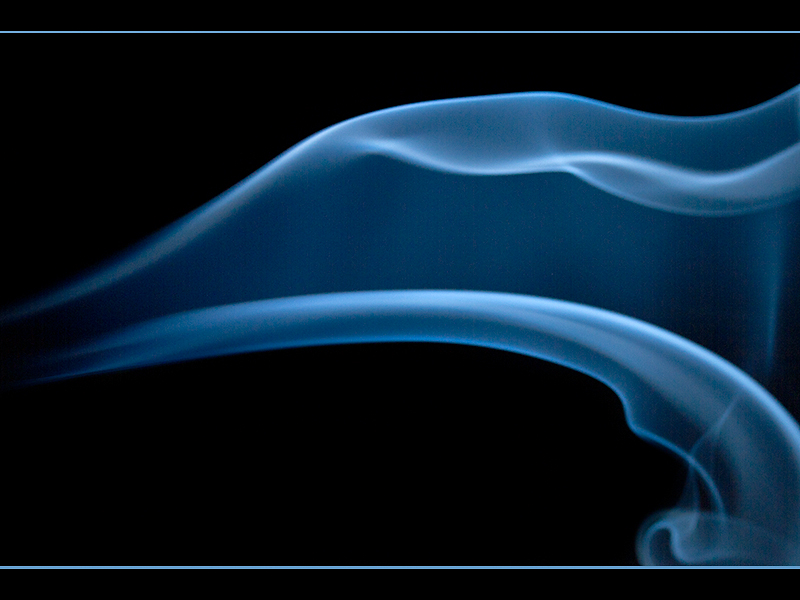
It is quite pretty, so scores well on the initial ‘oooh’ factor, but isn’t stay super interesting. I think I might have cropped a chunk off the left too; it would I think make the flowness more dynamic, plus the areas of void doesn’t really help and unbalances the overall appearance. The blue hue works well though, and it is very nicely illuminated. As a rule I don’t let borders influence my scoring; but if I did I’d have thought the blue line clashed a little bit, and it feels a bit too 80’s to me.
My First Weighted Scoring System ™; composition + technical 1.25/3, challenge* 1/1, post processing results 1/2, ooooh factor 2/3, originality 0.25/1 = 5.5 rounded to 6 (* I don’t think it’s possible to not meet the challenge on this one so everyone gets a 1/1) |
|
| Photographer found comment helpful. |
|
|
07/18/2011 10:33:35 AM |
|
This is fantastic. Like vapors of silk. This would be beautiful in a contemporary restaurant, office or home, enlarged HUGE on canvas. :) Good luck. 8 |
|
| Photographer found comment helpful. |
Home -
Challenges -
Community -
League -
Photos -
Cameras -
Lenses -
Learn -
Help -
Terms of Use -
Privacy -
Top ^
DPChallenge, and website content and design, Copyright © 2001-2026 Challenging Technologies, LLC.
All digital photo copyrights belong to the photographers and may not be used without permission.
Current Server Time: 06/29/2026 05:13:51 AM EDT.