| Author | Thread |
Comments Made During the Challenge  |
|
|
06/19/2011 08:49:42 PM |
|
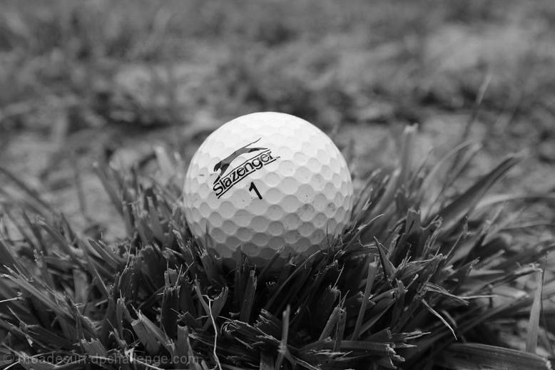
Personal opinion says that you may have needed a boost on that contrast bar. I think that would bring the ball to life more. Also, maybe add something to it. Like a flag or hole in the background or something. Just a thought for next time! :) |
|
|
|
06/19/2011 06:16:22 PM |
|
Black and white is good -- I like to give pictures like this a slight bluish cast/tint (especially in the white areas) to make it look colder. |
|
|
|
06/14/2011 09:13:17 AM |
|
I think you tried to make this staged shot believable with your placement of the ball, but why not use it as an advertising piece and get that logo nice and straight?? Other than that, a color shot would have worked a little better but I can see why you went B&W. |
|
|
|
06/13/2011 07:05:55 PM |
|
Concept is excellent, but the image seems washed out. It needs contrast. |
|
 Photographer found comment helpful. Photographer found comment helpful. |
Home -
Challenges -
Community -
League -
Photos -
Cameras -
Lenses -
Learn -
Help -
Terms of Use -
Privacy -
Top ^
DPChallenge, and website content and design, Copyright © 2001-2026 Challenging Technologies, LLC.
All digital photo copyrights belong to the photographers and may not be used without permission.
Current Server Time: 06/28/2026 03:42:33 PM EDT.