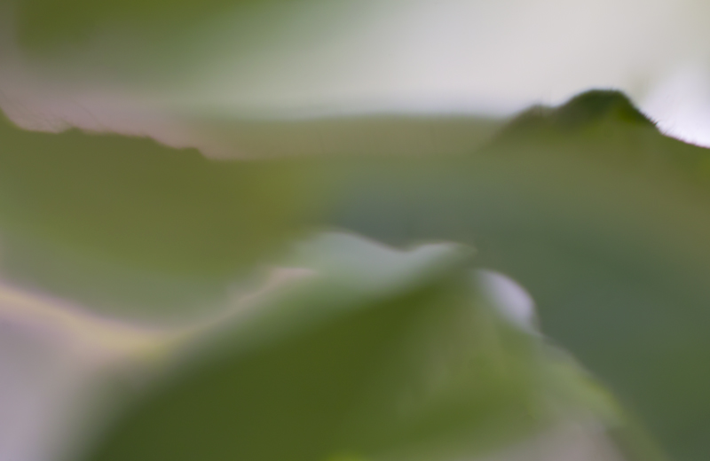
Since I said to myself that it's the last time I leave elaborate comments, I have to say that although I appreciate here the idea, this image is not appealing. And I do not mean likable, but mostly thought provoking.
The tonality is too processed, a bit muddy, the upper left corner too "painted". The pinkish and bluish hues could mean a lot more in a different color palette
LOL...one that makes me scratch my head, stare at it, think, stare some more and ask myself....what do I say? I like it but, it's not miminal landscape and yet, it's interesting but, not minimal landscape and then....think....I'm glad that I'm just commenting and not scoring! :)





 Add photograph to your favorites
 Add photographer to your favorites

 Photographer found comment helpful.


