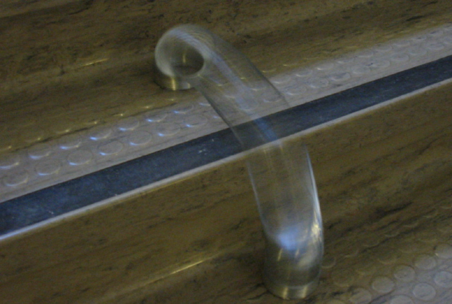
This photo could of defnintly been much improved over what I submitted. Check out //www.pbase.com/jgillard/dpchallengemotion to see what I mean. The reason I left this image not cropped/etc was because it was too noisy. Once I learned about neatimage (after the challenge had begun) I could of submitted a much better photo. Oh well. I was busy studying for my finals anyways and did not have much time to put into the challenge this week ;)
Critique Club
Composition Too centred with to much uneeded space at the sides. Shows motion.
Background - The background is too dull!
Camera work The image is technically good but very dark.
Digital processing The colours needed some hue and saturation to lift them a bit they all look rather washed out
My Opinion
The image meets the challenge but needs some life the colours are too dull and the image doesn't say look at me!







 Add photograph to your favorites
 Add photographer to your favorites


 Photographer found comment helpful.


