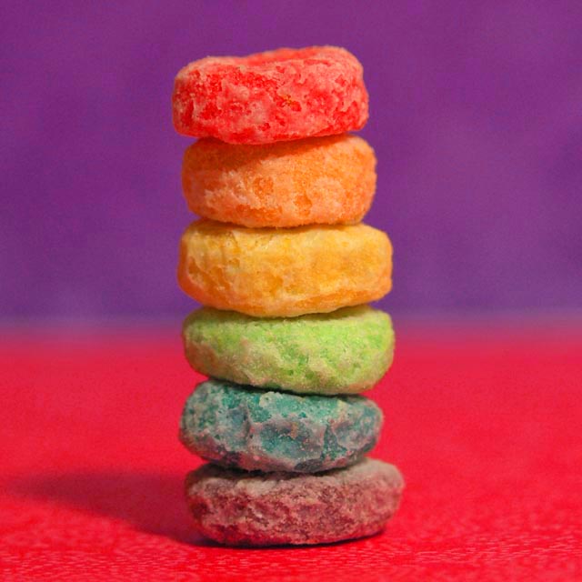
Just decided to do something colorful with the Froot Loops. I added a hue/saturation adjustment layer to make the loops more vibrant. I cropped it, too, to make it more symmetrical.
Statistics
Place: 130 out of 248 Avg (all users): 5.3503 Avg (commenters): 6.8000 Avg (participants): 5.2308 Avg (non-participants): 5.5833 Views since voting: 1405 Views during voting: 253 Votes: 177 Comments: 11 Favorites: 1 (view)
Very nice color scheme. It's quite simple, but also effective. Seems to have a lot of noise hought--maybe jpeg artifacts, and this takes away from all the interesting texture.
Unique idea. The colors on the fruit loops are great. The lighting is also good. I think a solid color background would have worked better, perhaps white - then the colors of the cereal would have been the only colors in the picture. Really a nice artistic idea!
Good picture technically and probably difficult to get focus just right. If it were me, I'd move the subject a little to the right or left to make the comp more interesting.






 Add photograph to your favorites
 Add photographer to your favorites

 Photographer found comment helpful.


