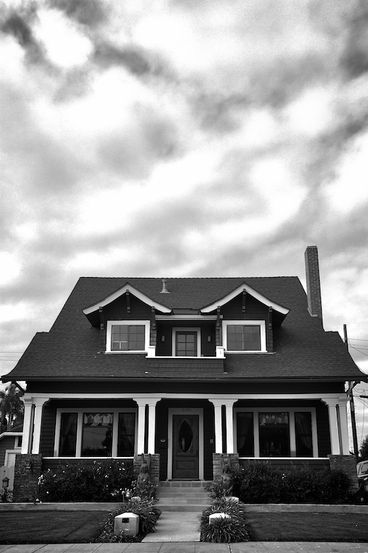
This is the oldest house in my neighborhood - one of the first "planned communities" in California, which is just outside of downtown. It's full of historic Craftsman houses, although this house predates that era (c. 1912). I shot this just after a storm had passed - it's a 3-photo HDR converted to B&W. Only minor editing aside from merging the photos. I was going for the feel Weston achieved in his "Connecticut Barn" image.
Statistics
Place: 119 out of 147 Avg (all users): 4.9882 Avg (commenters): 6.5000 Avg (participants): 4.7042 Avg (non-participants): 5.1939 Views since voting: 843 Views during voting: 287 Votes: 169 Comments: 5 Favorites: 0
Hello and greetings from the Critique Club.
In your photo, I do get some of the sense of starkness that permeated Weston’s work. Your photo is matter of fact, “here is the house,” even presenting it from the most matter of fact point of reference possible (the street, centered, dead on). But this is done to such a degree as to be to a fault. Many of Weston’s works contain standard objects which, though often placed in standard or typical poses/positions, are still depicted in a fashion that maximizes the lines present in them, exemplifies form. This is particularly seen in his architecture shots, which typically have a bunch of lines going this way and that. In those shots which are depicted head on, lacking in depth, there is a discord amongst the lines, a dynamism and tension created through including bits and pieces of structures, showing their relationship to one another. Many others show a structure from an angle, giving a more complete definition of form, showing their depth, their convergence, their many layers. I think your entry is robbed, somewhat, of this.
Ultimately, though, I think what had the largest effect on your score was the sky and the fashion with which the areas get blown. They are simply very distracting, they battle the subject for primacy, and this is very anti-Weston. I would like to note, however, that (in my opinion) the relative “Weston-ness” of entries was not really correlated to score (consider the top entry, a hallmark of romanticism). Whilst you may not know as a new DPC member, blown areas, and particularly areas blown with little reason, are a oft hated photographic element, and those areas in your are quite distracting, in any challenge. You’ve shown quite some Chutzpah in entering this challenge as your first, as the prompt had many scratching their heads quizzically, so I hope you stick around and keep at things. This wasn’t an easy challenge to score in, not least importantly because the voters didn’t really know how to vote it.
I think Weston's shots of buildings are like American Gothic. Matter of fact, centered, no frills, dispassionate. I think you've accomplished that here. I think you have great balance between lights and darks. I think this really works, well done!