| Author | Thread |
|
|
03/29/2011 10:17:15 PM |
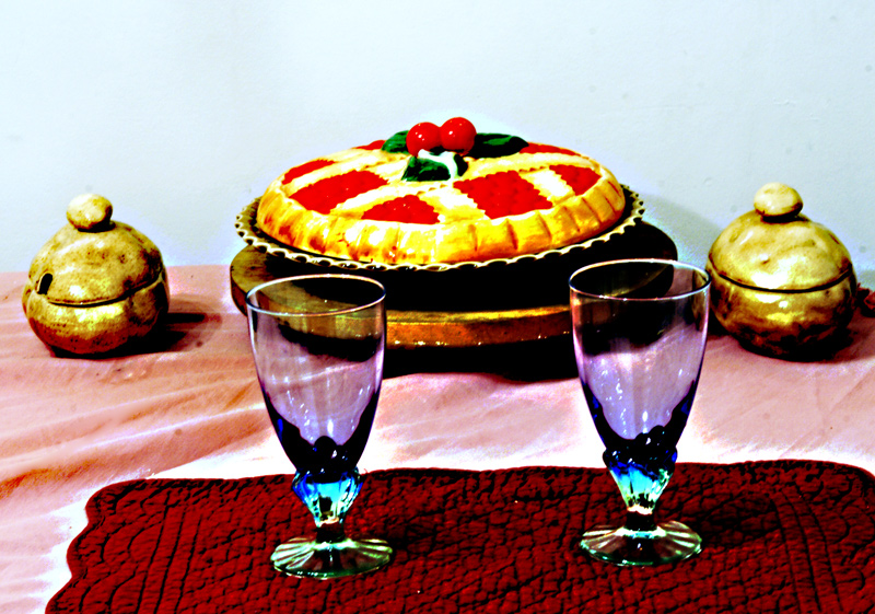
You've done some things very nicely here. First, overall, this almost looks more like a drawing than a photo, which gives it a different feel. Next, I think your plain light blue background is quite nice - not white, but feels "light". Your arrangement is also quite nice.
I'm not sure that I like the color of the wine glasses and placement in combination with the other colors in the shot. The purple in the glasses and burgundy of the place mat go together nicely, but they clash with the pink tablecloth, and the red of the pie. I don't know if you wrinkled the table cloth on purpose, but for me it distracts from the scene. |
|
 Photographer found comment helpful. Photographer found comment helpful. |
Comments Made During the Challenge  |
|
|
03/23/2011 10:56:11 PM |
|
I like the wine glasses, but I'm not sure that the post processing is my favorite. And I guess that I don't think of pie when I think of wine. |
|
| Photographer found comment helpful. |
|
|
03/23/2011 08:37:22 AM |
|
| Photographer found comment helpful. |
|
|
03/21/2011 05:16:32 PM |
|
The cherries look good... |
|
| Photographer found comment helpful. |
Home -
Challenges -
Community -
League -
Photos -
Cameras -
Lenses -
Learn -
Help -
Terms of Use -
Privacy -
Top ^
DPChallenge, and website content and design, Copyright © 2001-2026 Challenging Technologies, LLC.
All digital photo copyrights belong to the photographers and may not be used without permission.
Current Server Time: 06/29/2026 07:28:11 PM EDT.