| Author | Thread |
|
|
03/31/2011 12:16:37 PM |
|
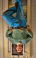
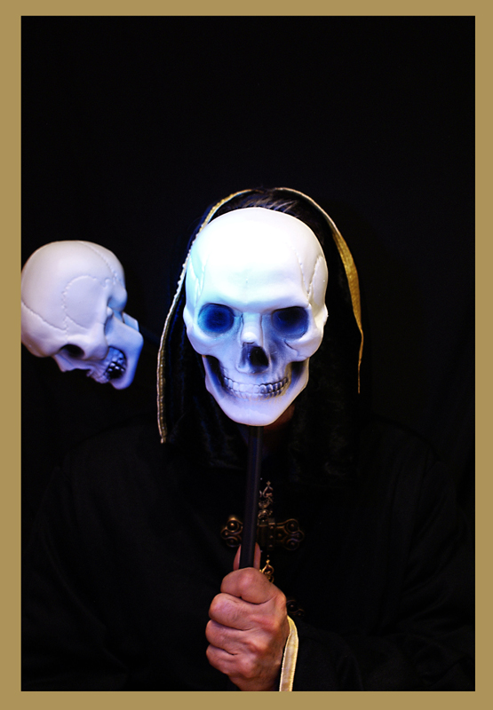
This was an excellent idea. My only criticism would be the lighting.. if you had balanced the lighting so it wasn't so sharp on the skull and brought out a little more detail in the black garb I think it would have been more effective. The second skull is probably not necessary but overall I really like it. |
|
 Photographer found comment helpful. Photographer found comment helpful. |
Comments Made During the Challenge  |
|
|
03/14/2011 04:57:20 PM |
|
the skull to the left seems out of place? unless i'm not understanding something about the photo. |
|
| Photographer found comment helpful. |
|
|
03/09/2011 09:01:52 PM |
|
The best "Death"! well done - I like the fact that you made your picture a card. |
|
| Photographer found comment helpful. |
|
|
03/09/2011 12:15:13 PM |
|
I like it. Looks like a Tarot card |
|
| Photographer found comment helpful. |
|
|
03/09/2011 10:23:47 AM |
|
| Photographer found comment helpful. |
Home -
Challenges -
Community -
League -
Photos -
Cameras -
Lenses -
Learn -
Help -
Terms of Use -
Privacy -
Top ^
DPChallenge, and website content and design, Copyright © 2001-2026 Challenging Technologies, LLC.
All digital photo copyrights belong to the photographers and may not be used without permission.
Current Server Time: 06/29/2026 04:45:48 AM EDT.