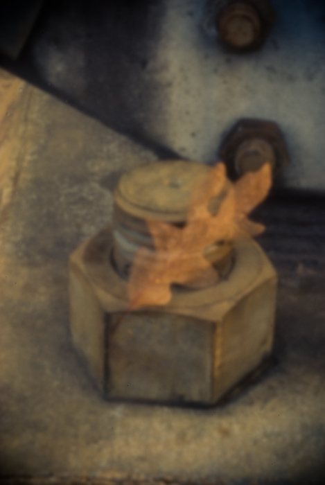
I don't know how to put this into words...this holds my interest and makes me want to study it more...but I can't exactly say why...it's not a super sharp focused picture...it's dead center...it's utilitarian...but I really like it
I'm going through the entries, stopping at those images I feel have had the benefit of an unconventional eye and dwelling a little longer to try to see and appreciate what you saw. This is one of those images.
Positives: This image does manage to intrigue - both from a technical and content perspective. Technically, the double-exposed appearance and the soft colours work really well.
Critical stuff: Compositionally, this doesn't quite work for me, the image seems a little out of kilter - I don't know why, I've tried different crops (with my hands) and your composition looks better than anything I can simulate.
Overall: A lot going for it but in the final analysis there is something that just doesn't click for me.






 Add photograph to your favorites
 Add photographer to your favorites

 Photographer found comment helpful.


