I had a duotone version of this that I didn't post because in bringing up the whites I felt it lost some of the dreaminess.
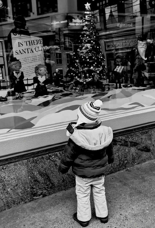
This was shot for outside looking in where the child would have been most important. I neglected to rethink it for FS as I should have gone back and evened out the viewing. So I agree with the commnts, for the most part. And I still like the picture, which took me three lunchtimes to accomplish.
Statistics
Place: 175 out of 275 Avg (all users): 5.4539 Avg (commenters): 5.8333 Avg (participants): 5.6500 Avg (non-participants): 5.0769 Views since voting: 492 Views during voting: 258 Votes: 152 Comments: 11 Favorites: 0
I'm going through the entries, stopping at those images I feel have had the benefit of an unconventional eye and dwelling a little longer to try to see and appreciate what you saw. This is one of those images.
Positives: OK, this is lovely, a very cute image with great story. There are a number of stand-out elements in the image - the Macy's sign, the newspaper, the reflected figure above it, the tree with its star...
Critical stuff: I've probably underscored it a little at a six but I am between a 6 and a 7. Reasons for not bumping to a 7:
For me, it lacks a little punch - I think this is down to the contrast profile, i wonder if brighter whites (shifted levels) would help. I'm a fan of grain and I'd add some, though I know that isn't everybody's cup of tea.
Those stand out compositional elements mentioned above are, I think, undersold - some curves manipulation or other technique to make these features more prominent might make a real difference.
I suppose what Im saying is that perhaps you have been too subtle with the image - you've concentrated on the child but for me the really interesting elements are in the top half of the image.
Overall: I think this is a great capture with a suboptimal edit (at least for the FS... for Outside looking In your emphasis is perfect)
See, I'm the sort of DPCer that loves this kind of image. It's intimate, and highly personal. There is a lot to see, and it requires analyzing and exploring. All the various elements all converge on the rapt attention of the little child. The tilt adds a bit of a Twilight Zone feel to it, something that may further alienate FS voters who seem to prefer easily accessible, feel good (rather thank think good) images. As I continue to explore the image, the "Is there a Santa Clause" question becomes a prominent element - one which I didn't notice before. And I love that we can see "Macy's" reflected in the window, which is where (I believe) where portions of the movie refer to.






 Add photograph to your favorites
 Add photographer to your favorites


 Photographer found comment helpful.


