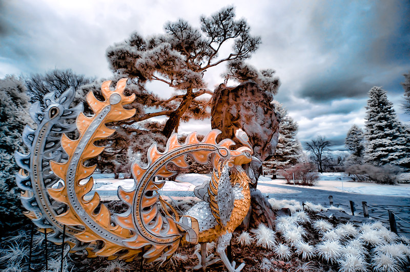
Phew! Breathtaking! Very subtle color complement. My top 5.
I don't quite understand why the top tree has an orange cast to its underside - a tungsten bulb out of view?
Elegant and unusual. I think this could have benefited from advanced editing to get the peacock to pop a bit more. For some reason, the orange/blue scheme seems to be easiest to present strongly in this challenge... I like your creative choice of subject matter.






 Add photograph to your favorites
 Add photographer to your favorites


 Photographer found comment helpful.


