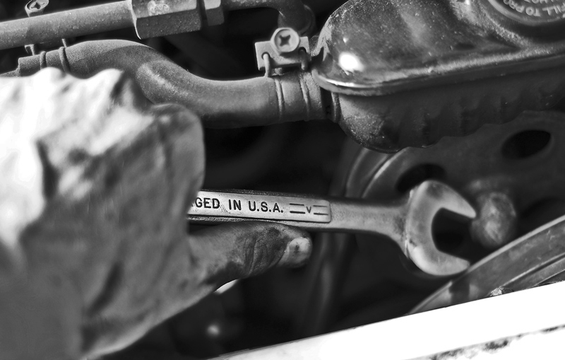
a tighter crop or a different angle could have made this image better. the white area at the bottom right was distracting. sharp focus would have been better on the head of the wrench
Great entry for this challenge. My one big critique of this is the blown highlight object in the front. That piece is distracting, but the rest is done well.





 Add photograph to your favorites
 Add photographer to your favorites


 Photographer found comment helpful.


