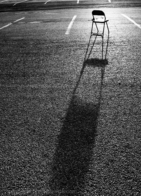
My initial take on this is that it is a classic 'photograph' - ie. 'writing with light'. There is no reliance on a pretty subject or fancy colours - this is a purists shot and a really nice example of one. Of course this means that it was never going to be a big hit with the voters in an FS, but I am sure you knew that and it is not your prime motivator!
Technically: You have gone for a pretty serious DOF with this, which works nicely, to capture the length of that shadow. That said, I would have found a slightly tighter focus on the chair more satisfying as a viewer, but that may just be me. The lighting, which this is all about of course, is excellent - all the more so since there is a hint of darkness about the photo as a whole.
Artistically: I like the concept of the composition, but the tilted line of the tarmac 'dip' across the top is a little distracting. Ideally I would get rid of it, but if that's not an option perhaps it could be level to add a sense of geometry? I also feel I would have liked to see the very end of the shadow, but again this might not have been physically possible.
In summary, this is a fairly classic shot and I, for one, hope to see more of these on the site! Happy hunting.
I'm going through the entries, stopping at those images I feel have had the benefit of an unconventional eye and dwelling a little longer to try to see and appreciate what you saw. This is one of those images.
Positives: Lots to like here, the light and the consequent shadow, the texture on the ground, the simplicity of the overall composition. I think the white lines at the top of the image are important too.
Critical stuff: Nothing really.
Overall: I really like this, an image that is more than the sum of it's parts.






 Add photograph to your favorites
 Add photographer to your favorites

 Photographer found comment helpful.


