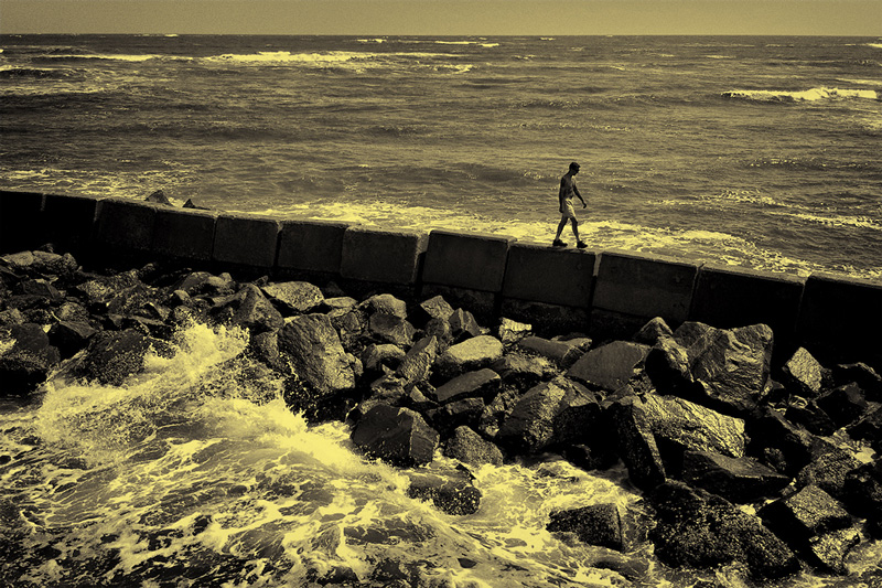
This guy really seemed to be lost in thought as he strolled back and forth atop the jetty.
I used the Silver Efex Pro filter in CS3 for the b&w conversion. I experimented with a bunch of straight up monochrome settings, but felt like the yellow (ambrotype) tinting did a better job of playing down the blown out highlights in the foreground waves while allowing for more contrast in the overall image.
Statistics
Place: 192 out of 296 Avg (all users): 5.4109 Avg (commenters): 5.3333 Avg (participants): 5.4409 Avg (non-participants): 5.3333 Views since voting: 734 Views during voting: 207 Votes: 129 Comments: 6 Favorites: 0
The yellowish tint to this is kinda off putting to me. I would Love to see the origional, However that being said I still think it's an outstanding Photo!
I'm going through the entries, stopping at those images I feel have had the benefit of an unconventional eye and dwelling a little longer to try to see and appreciate what you saw. This is one of those images.
Positives:The overall composition of the image is very sound and the included elements are effective at telling a story. The rocks in the foreground appear sufficiently treacherous to suggest your subject is in some jeopardy here.
Critical stuff: I'm not at all convinced by your toning choice here. I think a more straight-up monochrome or even a muted colour presentation may have worked a little better.
Overall: An effective image, but for me a sub-optimal presentation.







 Add photograph to your favorites
 Add photographer to your favorites


 Photographer found comment helpful.


