| Author | Thread |
|
|
12/09/2002 04:24:56 PM |
#203
Critique Club
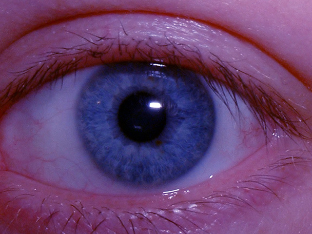
It's a blue eye and a very pretty.
The composition is alright, maybe cropped a bit too close - but - I'm sure it was do to the the size rules. Cutting off the bottom and end points takes away from the over all look.
The other suggestion would be the lighting. It's too dark to see the beauty of this shot. Good focus, good color.
|
|
Comments Made During the Challenge  |
|
|
12/07/2002 12:29:20 PM |
|
Great eye shot. Too bad face is red. |
|
|
|
12/07/2002 02:17:10 AM |
|
you'd better see a doctor about this |
|
|
|
12/06/2002 09:51:46 AM |
|
Check your white balance. Something is missing from this shot. |
|
|
|
12/04/2002 01:53:00 AM |
|
Would have been better if the eye were central in the frame rather than being cropped off at the left. What about if you dropped the red levels in Photoshop to remove the colour from the skin just to be left with the blue colour in the eye itself. |
|
|
|
12/03/2002 10:31:00 PM |
|
Trying to get the eye so blue you ruined the color of the skin around it.. The eyeball even looks blue. It is a very good close up other than that. Very clean, clear, and sharp. Should have left the other corner of the eye in with the same amount of skin showing on the outside, even if the iris would have been off center. It would have brought completion to the picture, in my opinion. PTL |
|
|
|
12/03/2002 08:29:00 AM |
|
|
|
12/02/2002 07:27:00 PM |
|
Old??? If this is old, it is well preserved. Color is certainly blue and meets the challenge. Well focused. I'd rather the left corner was not cut off though. Also a bit brighter or lighter I think. But it could be my monitor. Grayce |
|
|
|
12/02/2002 12:35:00 PM |
|
|
|
12/02/2002 11:44:00 AM |
|
Beautiful blue color. But the skin is such an unnatural shade of pink, it distracts from the eye. Perhaps the skin is that color after color-correcting to make the blue stand out? |
|
|
|
12/02/2002 08:31:00 AM |
|
Skin tone is horribly pink and the subject isn't very interesting. |
|
|
|
12/02/2002 08:09:00 AM |
|
eyes are becoming very cliched this week, I wont mark you down for that though.. above average pic, maybe a little dark and would of benefitted from upping the blue stauration... 6 marksimms |
|
|
|
12/02/2002 12:30:00 AM |
|
Great Macro. I would have liked this more if the lighting was a little better though. |
|
Home -
Challenges -
Community -
League -
Photos -
Cameras -
Lenses -
Learn -
Help -
Terms of Use -
Privacy -
Top ^
DPChallenge, and website content and design, Copyright © 2001-2026 Challenging Technologies, LLC.
All digital photo copyrights belong to the photographers and may not be used without permission.
Current Server Time: 06/28/2026 08:14:23 PM EDT.