| Author | Thread |
Comments Made During the Challenge  |
|
|
07/27/2010 11:47:17 PM |
|
beautiful "magazine" shot, or food advertisement shot. |
|
 Photographer found comment helpful. Photographer found comment helpful. |
|
|
07/27/2010 12:25:27 PM |
|
This is very simple and nice, i like it a lot |
|
| Photographer found comment helpful. |
|
|
07/26/2010 02:23:08 PM |
|
| Photographer found comment helpful. |
|
|
07/26/2010 12:07:34 AM |
|
So that is how you write it in French, my wife says it all the time to our children. |
|
| Photographer found comment helpful. |
|
|
07/24/2010 10:29:57 AM |
|
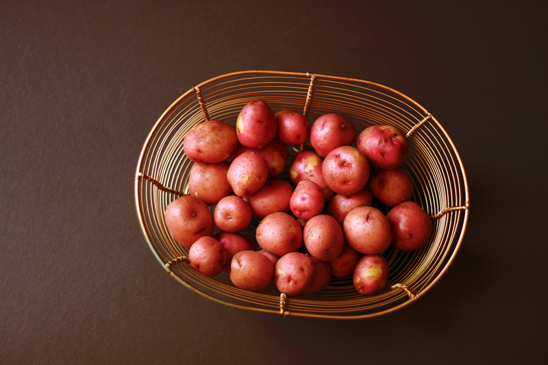
placing of potatoes could be given attention... a really excellent photo but the placing just does not grab me 7 |
|
| Photographer found comment helpful. |
|
|
07/23/2010 05:53:08 PM |
I like this, but a couple more things could make this a bit more interesting and engaging....yes, potatoes "could" be engaging...
if you had turned the basket/photo to be at an angle...that to me would add more interest, it's slightly turned now, but if it were slightly to the upper right side I think that would make a difference....something to get it away from that centered look
the other question I have....did you do USM...I also think that that would make a marked improvement...finishing polishing this off you could say...
no insult is intended...but yours stood out in the thumbnails and I had to take a closer look and remember...IJMO |
|
| Photographer found comment helpful. |
|
|
07/23/2010 05:49:40 AM |
|
I would like to see this image with a tighter crop...so that all you had was an image of potatoes...I think that could have worked really well. 5 |
|
| Photographer found comment helpful. |
|
|
07/22/2010 11:22:45 PM |
|
This is almost so good. It's clean, and well lit. But the composition seems a bit off, as though the tilt of the basket was non-committal. It's neither tilted enough, or too much. And the crop doesn't seem to follow any of the normal photographic rules. It's neither centered, nor thirds. |
|
| Photographer found comment helpful. |
|
|
07/22/2010 07:33:36 PM |
|
Nicely lit, and the potatoes are attractively coloured. |
|
| Photographer found comment helpful. |
|
|
07/22/2010 02:42:54 PM |
|
| Photographer found comment helpful. |
|
|
07/22/2010 09:38:39 AM |
|
The basket is a nice choice, but I think another background or a tighter crop would have worked better |
|
| Photographer found comment helpful. |
|
|
07/21/2010 03:13:34 PM |
|
Nice tones, very pretty lighting and basket. It's nice eyecandy and would likely make a great stock photo. 7 |
|
| Photographer found comment helpful. |
|
|
07/21/2010 01:31:54 PM |
|
I like the basic-ness of this photo. I wonder if it would have had more impact with a tighter crop. Maybe not seeing the background at all would have helped. |
|
| Photographer found comment helpful. |
Home -
Challenges -
Community -
League -
Photos -
Cameras -
Lenses -
Learn -
Help -
Terms of Use -
Privacy -
Top ^
DPChallenge, and website content and design, Copyright © 2001-2026 Challenging Technologies, LLC.
All digital photo copyrights belong to the photographers and may not be used without permission.
Current Server Time: 06/29/2026 05:34:45 PM EDT.