|
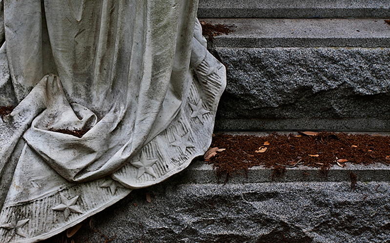
For me, the color in this shot doesn't do a whole lot, because the elements that are in color are neither subject matter nor attention grabbing. So when I see this shot, I think... what am I drawn to? For me, it's the edge of the hem, and the line that it creates through the image. I'd then think... what can I do to make that stand out more, to focus my attention on it? Personally, I'd do a BW conversion, increase contrast significantly and add some brightness into the hem itself through dodging, with maybe a little bit more right along the edge. The added contrast will accentuate the aged nature of the stone, and the excellent textures will become more apparent. |