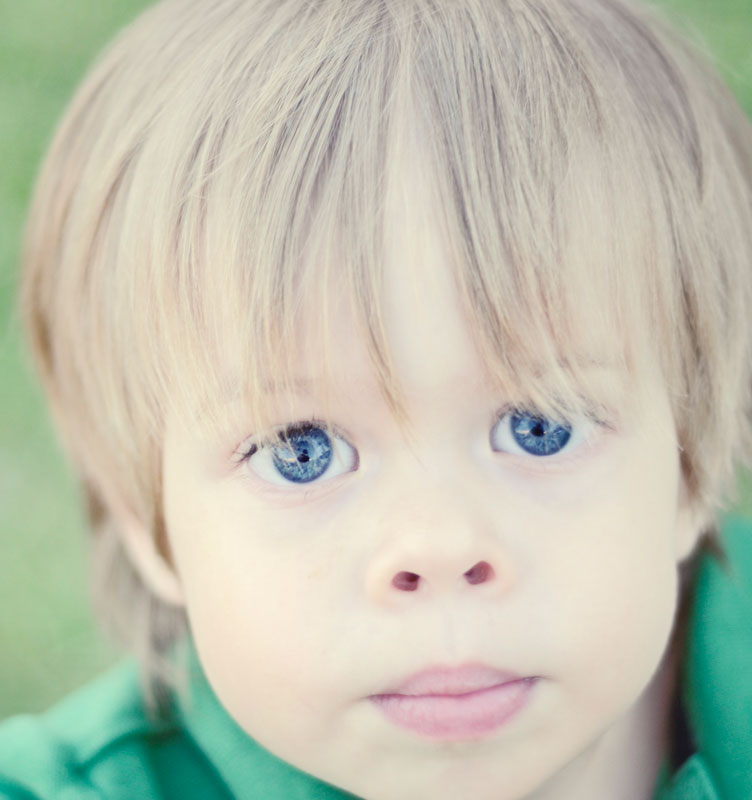
i really like his expression. the eyes are just awesome! but i don't particularly care for the muted colors in the rest of his features. only a personal opinion tho.
Overly long title with little apparent connection to the subject + washed-out tones + apparently needless soft focus + arbitrarily bottom-heavy composition + uninteresting pose and facial expression + unnecessary view inside the kid's nostrils = 4.
OVerall, this is good. The filling of the frame with the face adds emotion, and the bright blue eyes are beautiful. but the rest being so pale is really taking away from the photo (for me).
Not really a fan of the processing to be honest. I understand you were trying to draw attention to his eyes but the effect is rather unsettling. Its a shame because I think you got perfect focus on the eyes and the exposure is right on. I'd be quite interested in seeing the original for comparison once voting closes.




 Add photograph to your favorites
 Add photographer to your favorites


 Photographer found comment helpful.


