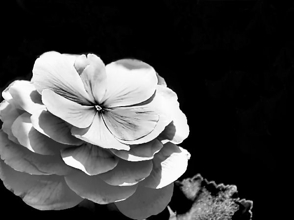
I was one of the 4 votes. The first thing I noticed is the flower seems to be floating, and while I normally like a solid black background it doesn't work for me in this shot. The leaf is a distraction. The lighting seems bright, causing detail in the petals to be lost and giving harsh shadows. The title makes me think of softness yet the image seems hard. This, of course, is only my opinion, and should be taken as such.
I gave it a 5 but what was commented here pretty much sums up my thoughts to a T
The light is too powerful and washed away the details. There are harsh shadows. The flower can be a little higher in the photo. If you have an external flash, try shooting with it. Place it about 2 o clock position so the light come from a slight angle to the right to bring out the texture. Very low power touch of light from a second flash can light the shadows also. If there are no flashes, try using evening light from side and a reflector (white card board) from left to light the shadows.
And never mind the points. Just concentrate on shooting better. After you shoot the flower well, skip something else. Try some portrait. Good luck.
I gave it a 7. Composition wasn't the best, but I liked the b/w tones in it. I'm looking at it on a different monitor now and I can see some gray blotches in the background on the right, as if something else is there in the shadows.
I was one of the 4 votes. The first thing I noticed is the flower seems to be floating, and while I normally like a solid black background it doesn't work for me in this shot. The leaf is a distraction. The lighting seems bright, causing detail in the petals to be lost and giving harsh shadows. The title makes me think of softness yet the image seems hard. This, of course, is only my opinion, and should be taken as such.
Not sure why it scored so low however one thing to note. Make sure you go to the full size allowed. There's no reason to submit an undersized image. Bigger images usually look better and have more impact. Let us know what program you are using and maybe we can find some help on resizing and prepping your image for submission.
In my own opinion it may have suffered as there seems to be too much contrast in the image with the highlights seemingly to be over blown. The composition is not bad but the leaf in the bottom right grabs a lot of attention as well and almost looks like there was a little too much sharpening added as some of the edges are starting to get jagged. These are my honest opinions and prob would have gotten a 5 or 6 from me if I were voting.
Hi, Kim.
Since you asked for feedback, I'll give you my first impressions. I think flower photos are a hard sell to begin with. They have to be exceptional to score well.
I like your composition and the black space, however there isn't much visible detail in the petals. Some parts are over-exposed and that blasts out all detail, but even the grayer areas are soft. Looking closely, it appears you sharpened to help bring out detail, but as a result you have some rather jagged edges.
I don't see this as a 1,2,3, or 4 score. I like the composition and the black and white. I think that it may be just a bit on the fuzzy side, but that can be fixed with some unsharp mask or sharpening it up some. Maybe the vothers didn't like the black and white. Not sure. Free studies are harder to score well in because the subject matter is open. Who knows what the voters were thinking.
I am struggling myself with my images and what would make them better. I will continue to try and improve. Lovely shot by the way.






 Add photograph to your favorites
 Add photographer to your favorites

 Photographer found comment helpful.


