| Author | Thread |
Comments Made During the Challenge  |
|
|
05/25/2010 08:32:08 PM |
|
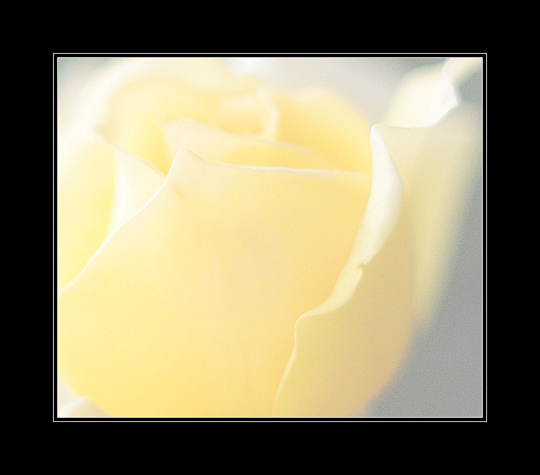
Beautifully delicate. Great minimalism too. |
|
 Photographer found comment helpful. Photographer found comment helpful. |
|
|
05/23/2010 01:22:02 AM |
|
this heavy frame kills it. such great texture and mood without it. |
|
| Photographer found comment helpful. |
|
|
05/22/2010 04:18:56 PM |
its a to light
cant really tell what it is
to close |
|
| Photographer found comment helpful. |
|
|
05/21/2010 08:35:42 AM |
|
border is much overdone, IMO |
|
| Photographer found comment helpful. |
|
|
05/20/2010 02:54:27 AM |
|
A Rose, by any other name. Lovely soft image, a bit of grain, not serious. Decent composition. Not a lot of bokeh to be seen BEHIND the subject (i.e. Background OOF area) |
|
| Photographer found comment helpful. |
|
|
05/19/2010 12:33:16 AM |
|
I like the shot, but for me the border is overpowering- When it first pops up on the screen it's hard to see the beautiful lines and subtlety in the flower at first because of the sharp contrast. The voter's first impression is a blob of white surrounded by a sea of stark black (people are rushing through :( ). I'd recommend a much lighter border. I won't vote it down for that, but wanted to let you know. Good luck in the challenge! |
|
| Photographer found comment helpful. |
Home -
Challenges -
Community -
League -
Photos -
Cameras -
Lenses -
Learn -
Help -
Terms of Use -
Privacy -
Top ^
DPChallenge, and website content and design, Copyright © 2001-2026 Challenging Technologies, LLC.
All digital photo copyrights belong to the photographers and may not be used without permission.
Current Server Time: 06/30/2026 06:02:24 AM EDT.