| Author | Thread |
Comments Made During the Challenge  |
|
|
07/08/2004 08:31:40 PM |
|
|
|
07/08/2004 01:59:57 PM |
|
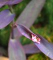
If this is purple, then my hair is green! Good composition though, has a very nice texture. |
|
|
|
07/07/2004 10:18:19 AM |
|
Good technical photo. The subject and composition does not hold my interest, though and it looks really blue on my monitor. |
|
|
|
07/07/2004 07:29:04 AM |
|
Sorry but I dont understand this picture, what is the story to tell - if you really like this planter that much, why dont move it around a littel so the surroundings would be more appealing for the picture. Sorry 1 from me. |
|
|
|
07/06/2004 03:04:56 PM |
|
Sorry to say but on my monitor your main color is blue, pretty blue but blue |
|
|
|
07/06/2004 09:27:38 AM |
|
I'll admit that variances in computer monitors might be the problem here but I see nothing purple in this photo. |
|
|
|
07/05/2004 08:02:38 PM |
|
looks blue to me im afraid but i know purple is a hard colour to define especially as everyone's monitors are different :/ |
|
|
|
07/05/2004 04:33:39 PM |
|
|
|
07/05/2004 03:30:06 PM |
|
This could be my monitor, or it could be my eyes but for me this pot is blue... |
|
|
|
07/05/2004 01:33:59 PM |
|
This looks blue on my monitor. Sorry. Even so,it's kind of a dull composition. The planter has potential as interesting subject matter but I would have cropped out the unnattractive foliage, the wood, and the grass in the background. None of these elements add to the composition. The whole thing looks rather drab and colorless. |
|
|
|
07/05/2004 10:29:53 AM |
|
Uninteresting composition. I'd much rather look at what's planted above. Would've positioned the planter more to the right and much lower in the frame. |
|
Home -
Challenges -
Community -
League -
Photos -
Cameras -
Lenses -
Learn -
Help -
Terms of Use -
Privacy -
Top ^
DPChallenge, and website content and design, Copyright © 2001-2026 Challenging Technologies, LLC.
All digital photo copyrights belong to the photographers and may not be used without permission.
Current Server Time: 06/28/2026 03:44:24 AM EDT.