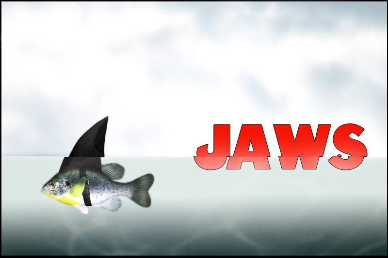
Ha! Nice concept. I wonder though, if a subtle wave or ripple would have given it a little more coolness but I like what you did here. Now you seem to have gone out of your way to make it very unposter-like with the landscape and the border but for me they really don't bother me. What does (a little) is the black outline on the font. Actually it doesn't bother me. It's just dated and not in that hip-retro way either. Ok I said enough. Good luck.







 Add photograph to your favorites
 Add photographer to your favorites


 Photographer found comment helpful.


