I downloaded this to my Critique Club folder so I could view it in PS and crop out the border which I found really overwhelming and unattractive, point I made rather too bluntly during the voting.
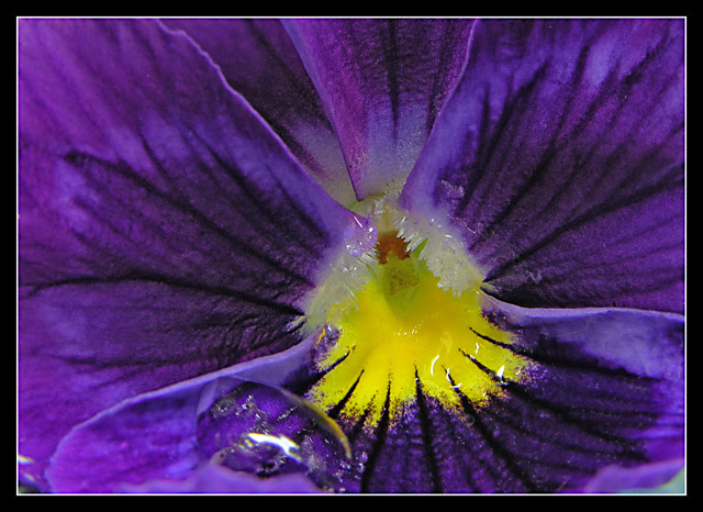
I really enjoy the vibrant contrast between the purple and yellow which, as I'm sure you're aware, are complementary colors. While it is possible that centering the yellow would make a more dynamic composition, I'm not convinced of this. I rather enjoy the off-center placement.
I agree with the other commenters that the water droplet adds a distracting note to an otherwise very simple, dynamic scheme of color and radiating lines. This is just a nit but I feel this could have been cropped to eliminate the blurry patch of grey-blue at the bottom right corner which detracts from the simplicity of the purple and yellow.
This is the kind of composition that would look fabulous blown-up extra-large.
There have been many shots of this type submitted to various challenges in the past (mine included).. so they really have to have something special to offer and I think this does..the splash of yellow, which always contrasts well with purple, gives the image the lift it needs and adds to the overall abstract quality.
Nice work






 Add photograph to your favorites
 Add photographer to your favorites


 Photographer found comment helpful.
