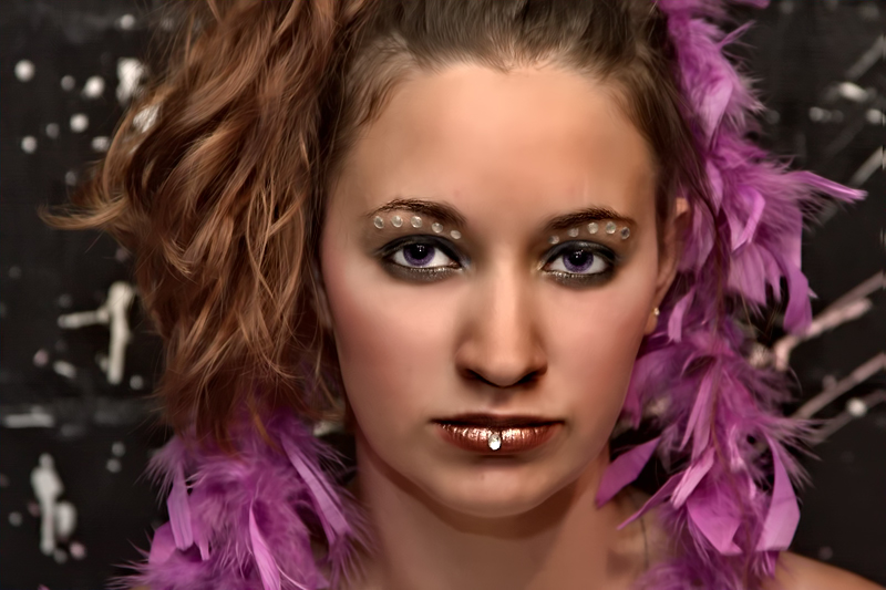
Coming back to this shot, it really is, or m, much, much better than the one you entered - the 'in your face' expression of your model (which is thoroughly contemporary) really suits the head-on composition. The processing style, which is probably a little more processed than I prefer, also works better; of note, in the original there was some ugly shading around the nose which really stood out for me - here everything is more balanced. I still feel that you could pull back on the processing a bit, and would end up with a better image for it - you have a stunning model, and your photography itself is good - let them shine through!
Edit - an afterthought, I think that the style you have gone for would be complemented by an off-centre composition, with the model on the 1/3rd and plenty of negative space to the right.
Message edited by author 2010-05-06 14:57:47. |