| Author | Thread |
Comments Made During the Challenge  |
|
|
04/25/2010 07:10:45 PM |
|
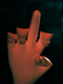
Going to have to give this one a low vote I'm afraid. Badly tilted, white balance is off, which gives an unpleasant color cast, and the subject is shoved all the way over to the right side of the frame and partially cut off. |
|
 Photographer found comment helpful. Photographer found comment helpful. |
|
|
04/23/2010 09:12:59 PM |
|
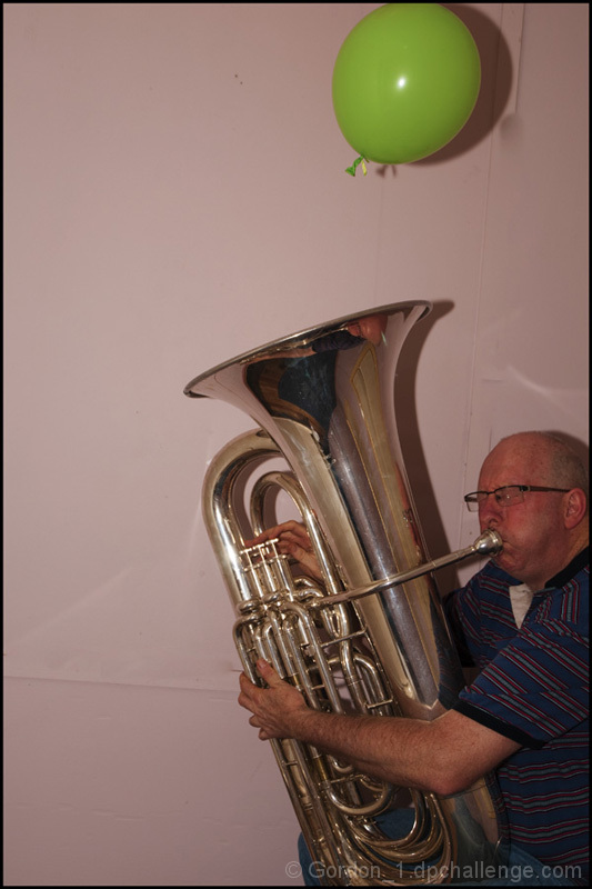
Made me laugh if nothing else. |
|
|
|
04/23/2010 08:08:55 AM |
|
You know, I think that this could have had a little better lighting and editing, but I think it was a really good idea and in my opinion thats where good pictures come from. Also, you can see the shadow from the fishing line:P Just a little polish and I think you could be on your way:) |
|
| Photographer found comment helpful. |
|
|
04/19/2010 09:11:48 PM |
|
This was a nice unique idea. I think execution could have been better. There is an overall color cast that makes this look too pink. Also, if you pull the subjects away from the wall a bit you can help get less shadows and also have the wall look more like a back drop and less like a wall. After that I would say brighten it up a bit and maybe even see how you like it with a black and white conversion. |
|
| Photographer found comment helpful. |
|
|
04/19/2010 01:24:18 AM |
|
Love the expression. He looks like he's really going for it. |
|
| Photographer found comment helpful. |
Home -
Challenges -
Community -
League -
Photos -
Cameras -
Lenses -
Learn -
Help -
Terms of Use -
Privacy -
Top ^
DPChallenge, and website content and design, Copyright © 2001-2026 Challenging Technologies, LLC.
All digital photo copyrights belong to the photographers and may not be used without permission.
Current Server Time: 06/28/2026 11:08:30 PM EDT.